As fulltime product design lead, I worked to define the problem, scope the opportunity, and iterate on the solution – alongside my PM and stakeholder team. I led the team in an iterative design-thinking process, keeping customers in the loop.

The goal is to increase LTV for two personas, by building a monthly habit.

Role

Head of Product Design / Solo Designer & Researcher

Product

A web app for accountants and business owners to track and forecast their finances, as well as prepare for funding rounds. Users are across all continents. Product is also used in Academia across the USA.

Most Proud Of

Walking an apprehensive stakeholder team through a design-thinking process, and ultimately converting the team to a more iterative human-centered mindset.

Phase 1 - Define the Problem

Problem

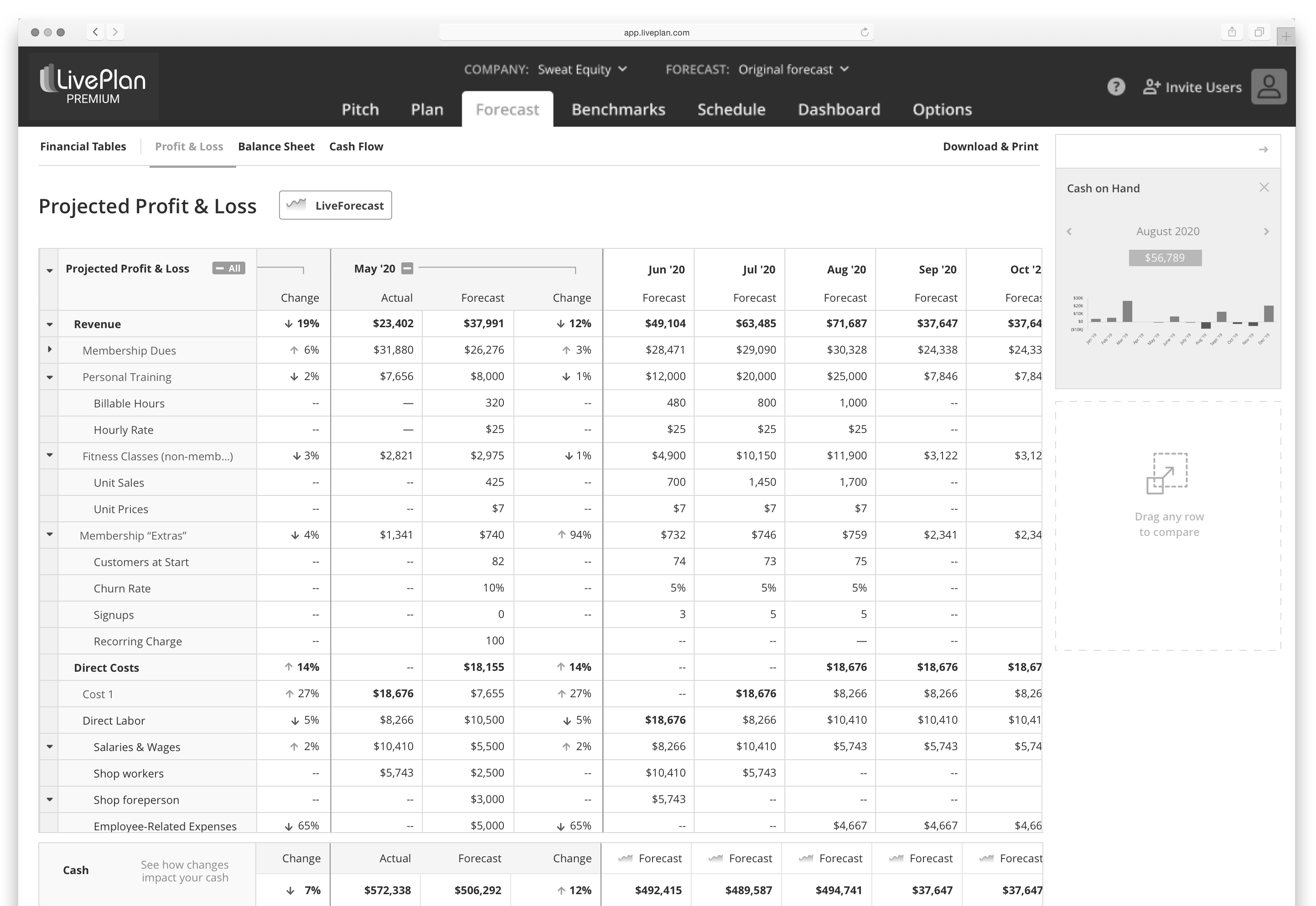
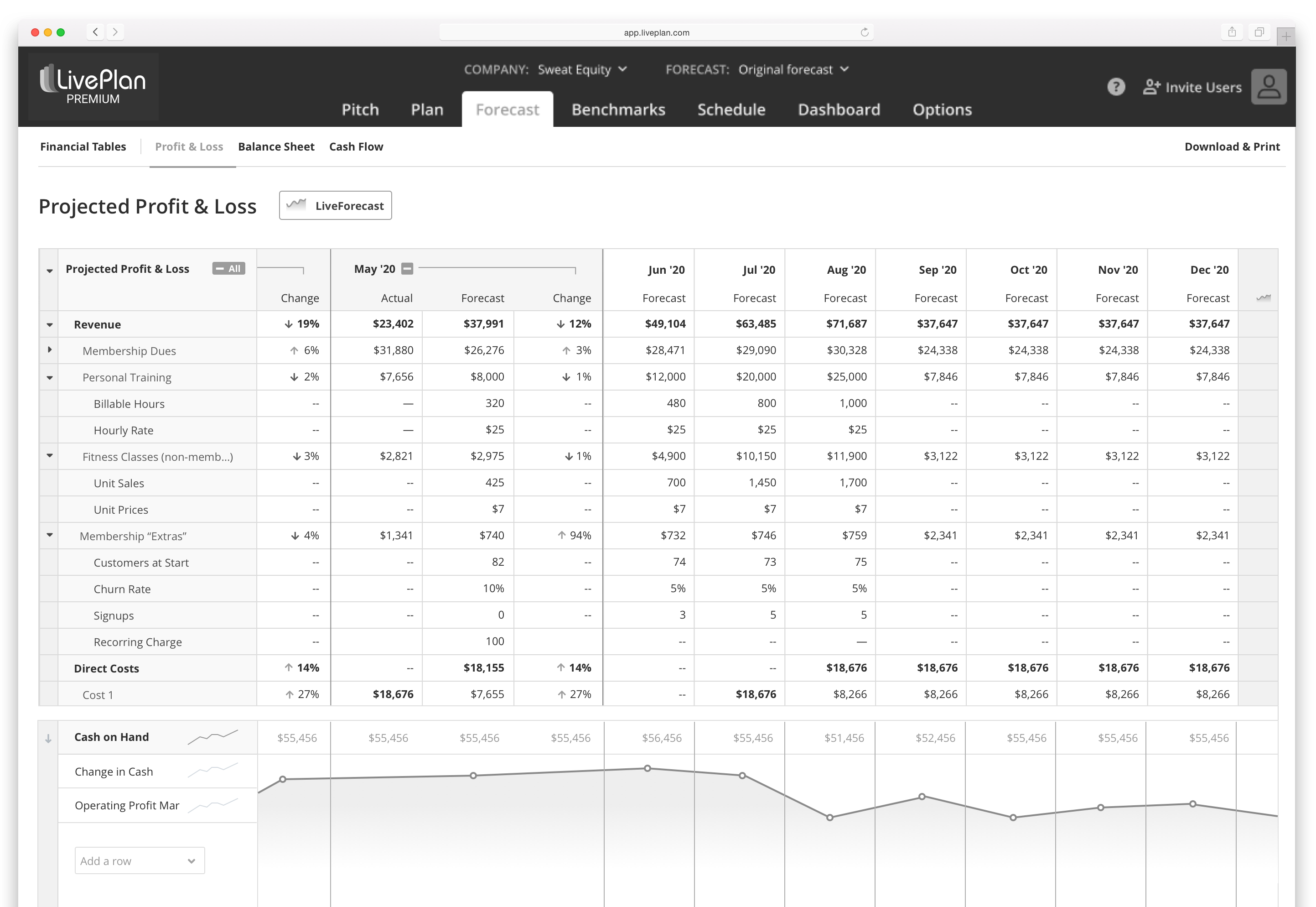
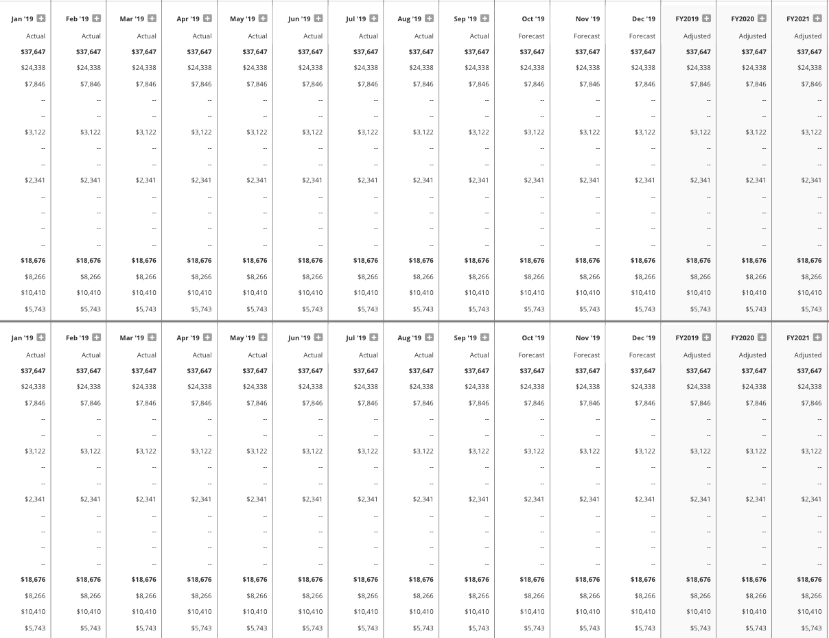
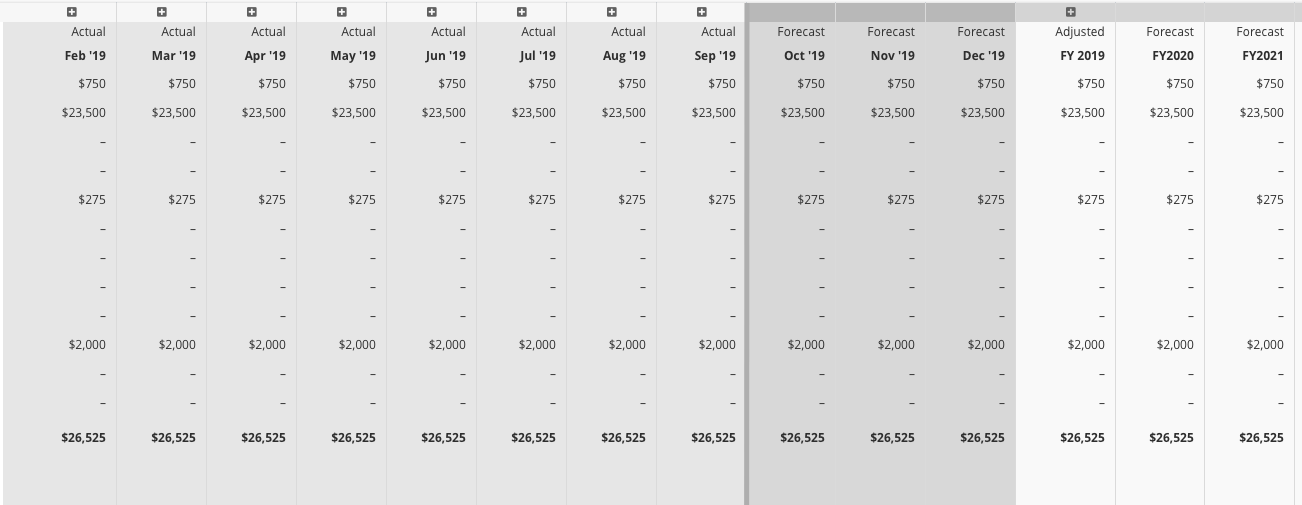
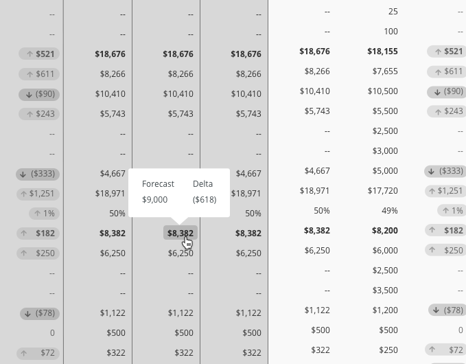
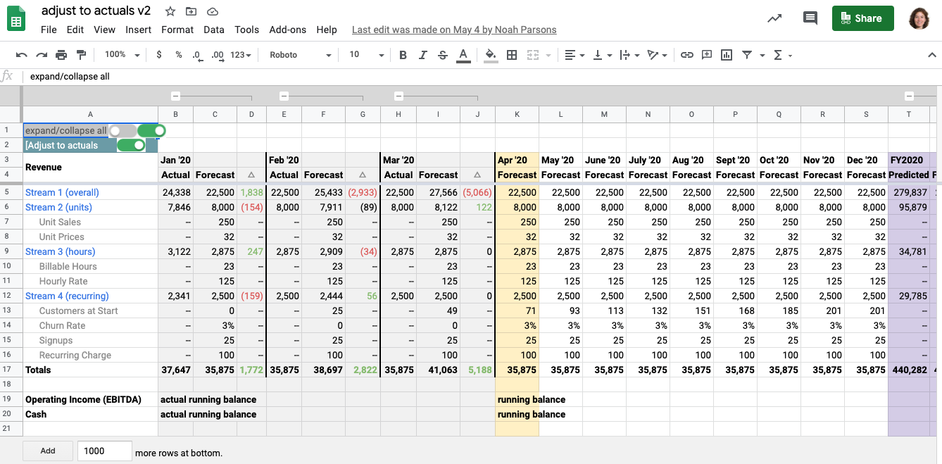
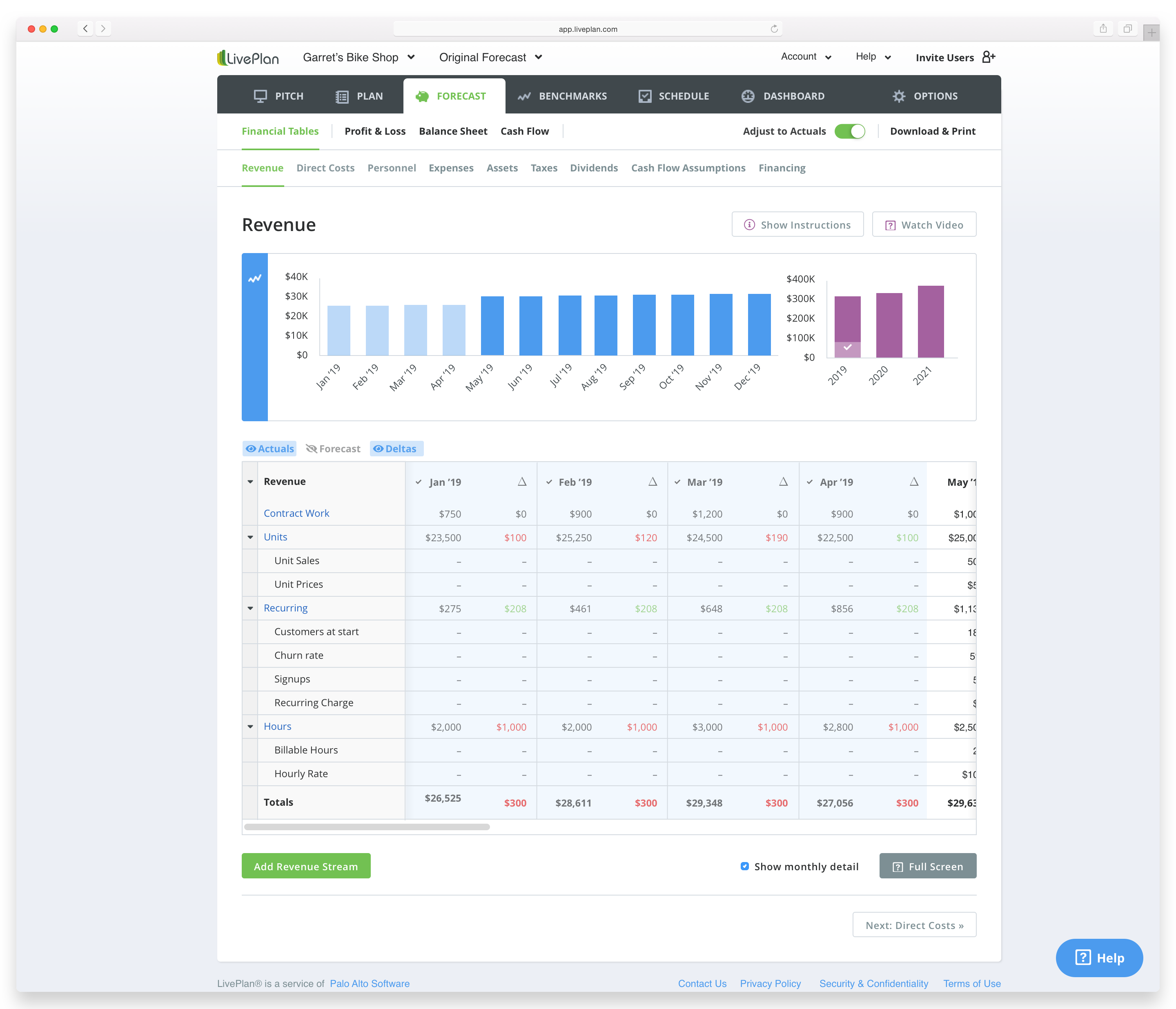
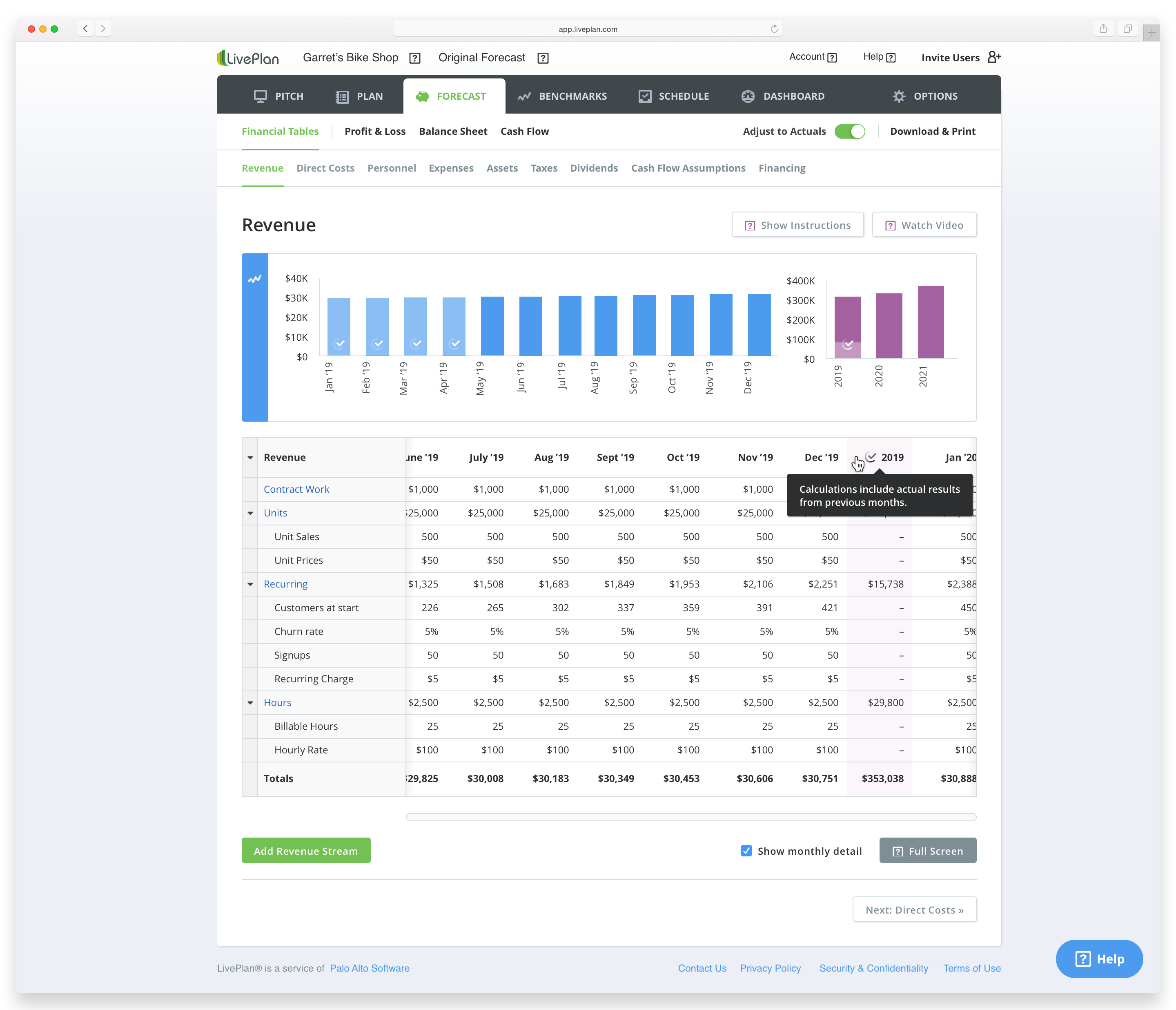
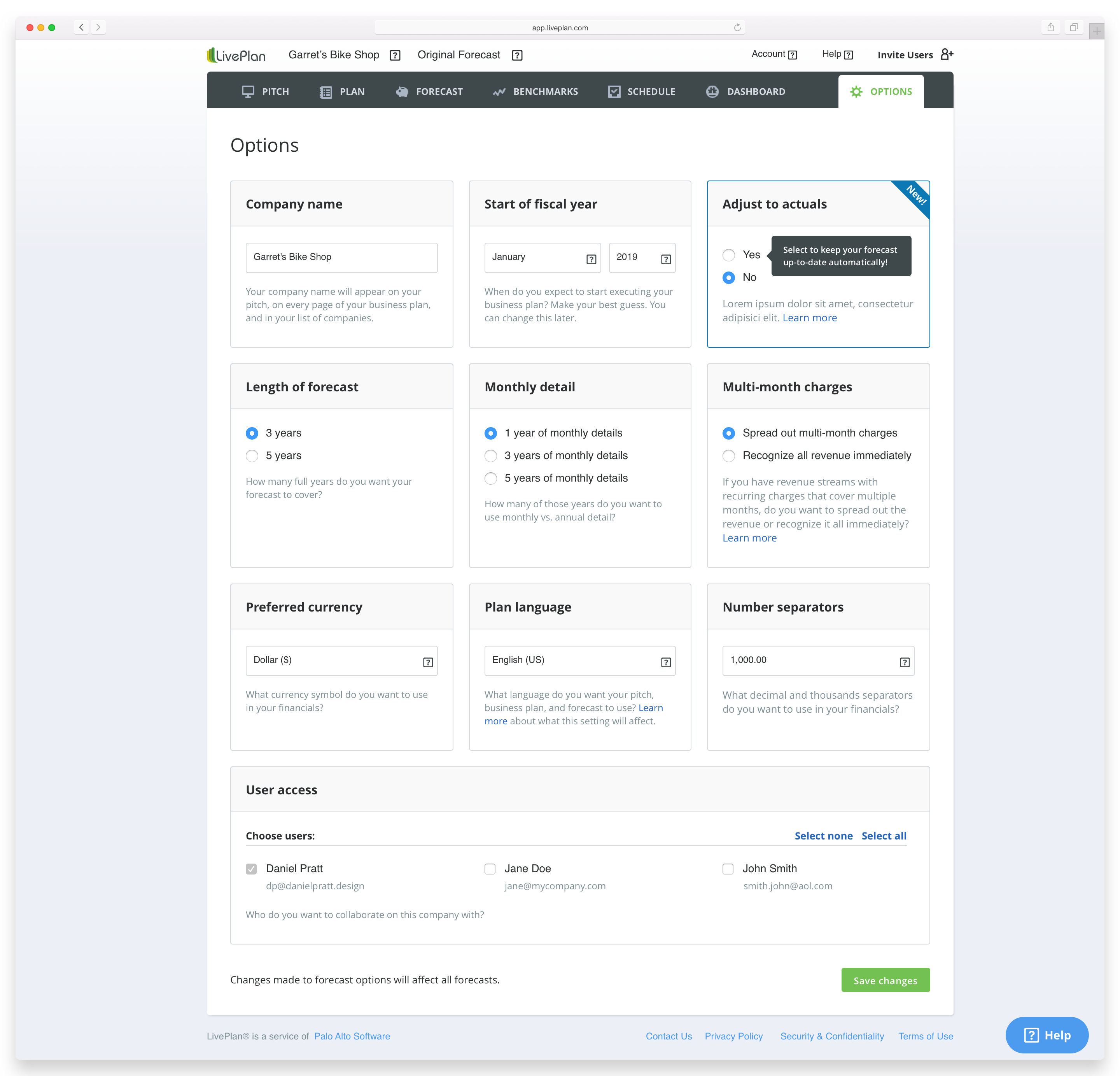
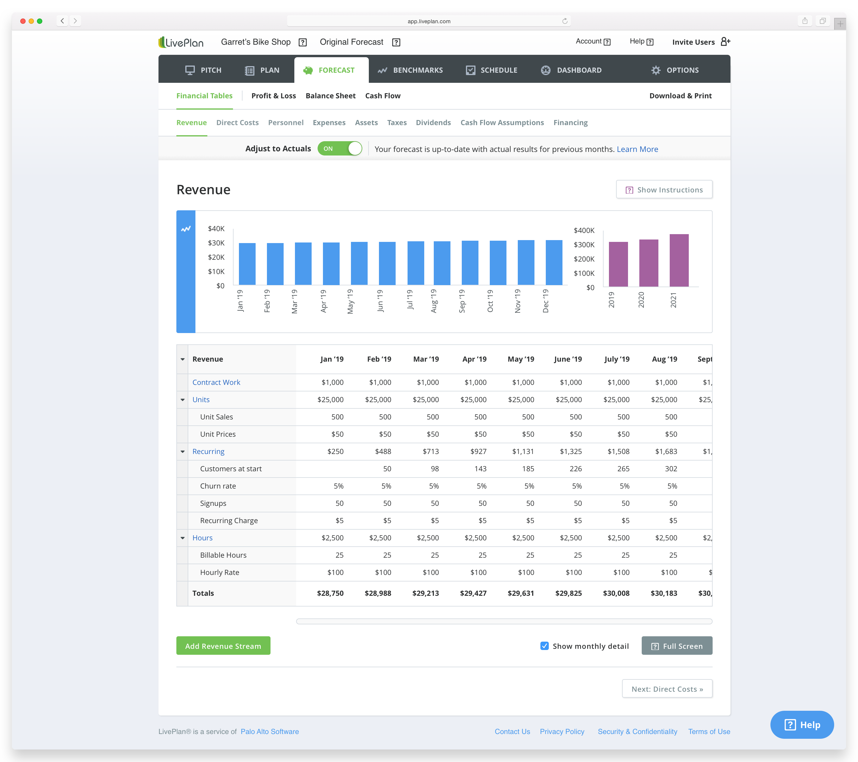
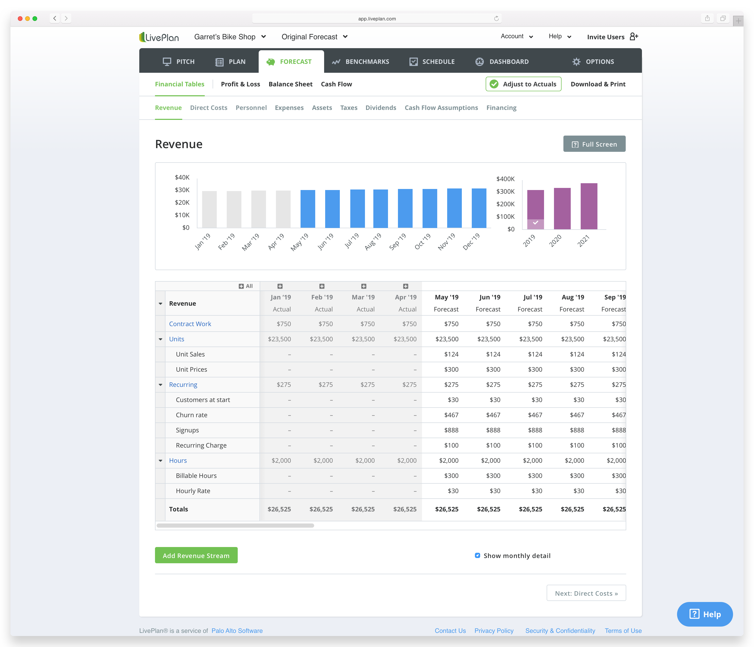
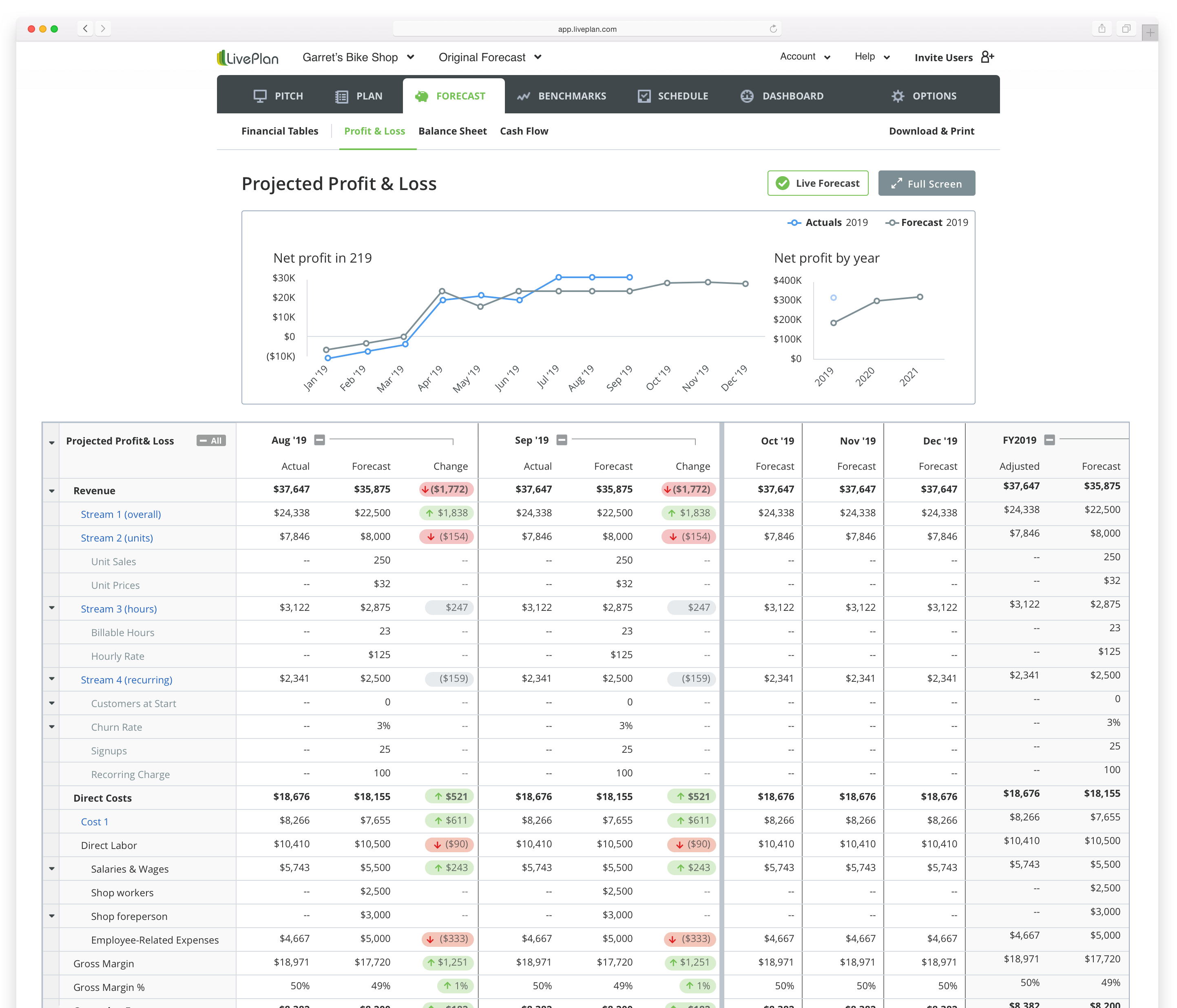
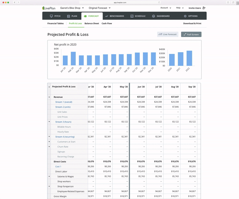
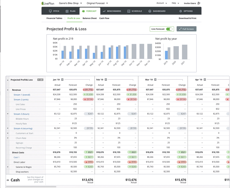
Our SMB users (and/or their accountants) needed to have an accurate, automatically updated, prediction of how much cash their business will have in the future, as well as 'trued-up' actuals for their forecasts for revenue and expenses.


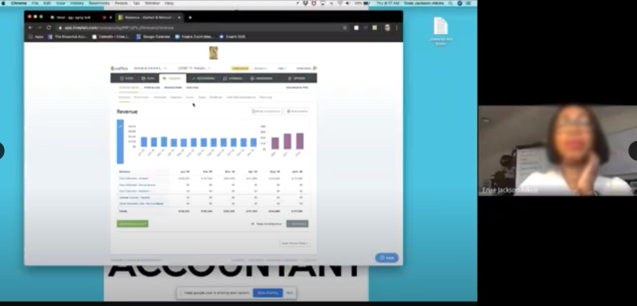
User Interviews & Data

Before scoping a solution we dug through customer data from customer support calls, webinars, bootcamps, and qualitative interviews. We analyzed how wide or narrow users defined the problem, their frustration levels, where in their product journey they were, and what type of persona they were.

KPIs

Correlation to LTV
Per user engagement duration
qualtitative feedback
Ability to drive more users to connect accounting data

Phase 2 - Ideate & Test


Wireframe - Wide Ideation

Geeking out on table design patterns and creative ways to meet user needs, we explored ideas and discusses feasibility with engineers. To allow stakeholders to experiment on their own, we even created realistic data sets in g-sheets.


Higher Fidelity Exploration

Do users need this in every forecast table, or just a few? Do users understand and trust how actuals are calculated? Do users need to see the deltas, or just the actuals? What colors best represent the data? Where in the app do users expect to interact with this affordance?

Do users need to see the deltas, or just the actuals?

Do users understand and trust how actuals are calculated?

Where in the app do users expect to interact with this afforance?

Do users need this in every forecast table, or just a few?

What colors do users associate with this data?

What chart type is most intuitive?


For each area of exploration shown in these images above, there were dozens of iterations per inquiry. Each image represents many explorations.

UI elements

Here is one example of a UI element with some iterations.


Final button

Phase 3 - Usability Testing

We conducted 30-60min usability tests with interactive prototypes – half with small business owners, half with accountants, all are current clients that have positively reviewed us.


Insights learned

In addition to usabilty pitfalls, color choices, and UI expectations, we learned about what guidance users rely on for a feature like this, what information they need up front in order to trust it, and what value it unlocks for them, in their own words.


"Nifty...This gives me the blood pressure of the business"

"Cashflow is where the value of my forecast is...at this point I could make business decisions or change my forecast."


Final Designs

Although we had to make large sacrifices to get the MVP out the door, we found a delightful way to deliver a v1 with core value.

Rollout


Our rollout strategy is in phases, and not A/B tests, due to lack of resources.
Phase 1 – power users, with no onboarding or feature discovery UX required. As we build out feature discovery UX flows, we will get feedback from power users.
Phase 2 – all Accountant persona users with feature discovery flow.
Phase 3 – Business owner persona who has accounting connected.
Phase 4 – all business owners who have not yet connected their accounting data.


We hope to iterate on this feature quickly after releasing, building out more functionality that had to get stripped when scoping the MVP requirements.