For 1 year I led UX, launching and iterating on a multitude of experiences - onboarding, mobile app, establishing a UI library, persona building, and many specific UX flows.

I worked side-by-side with data analysts, growth managers, and engineers, to craft and iterate on optimal user experiences. Here are just 4 of those initiatives.

Role

Lead/Solo UX straddling initiatives in user research, roadmap prioritization, and UX.

Client

Fast growing fintech startup – a chatbot and mobile platform that helps you track, understand, and feel less stressed about your money.

Most Proud Of

Implementing an agile process of human centered design while iterating on tractable small features.


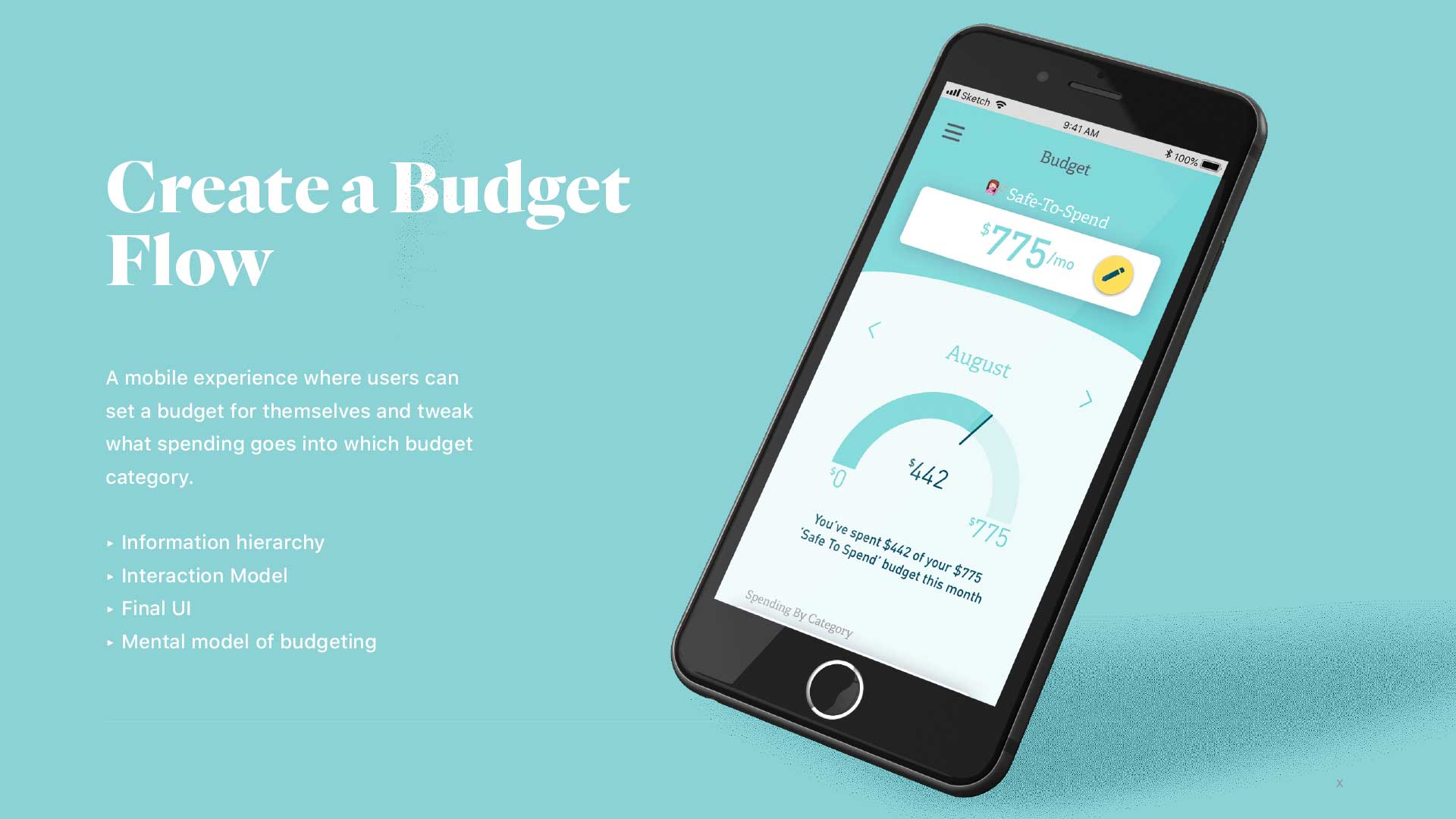
Project 1 - Lauch a mobile app

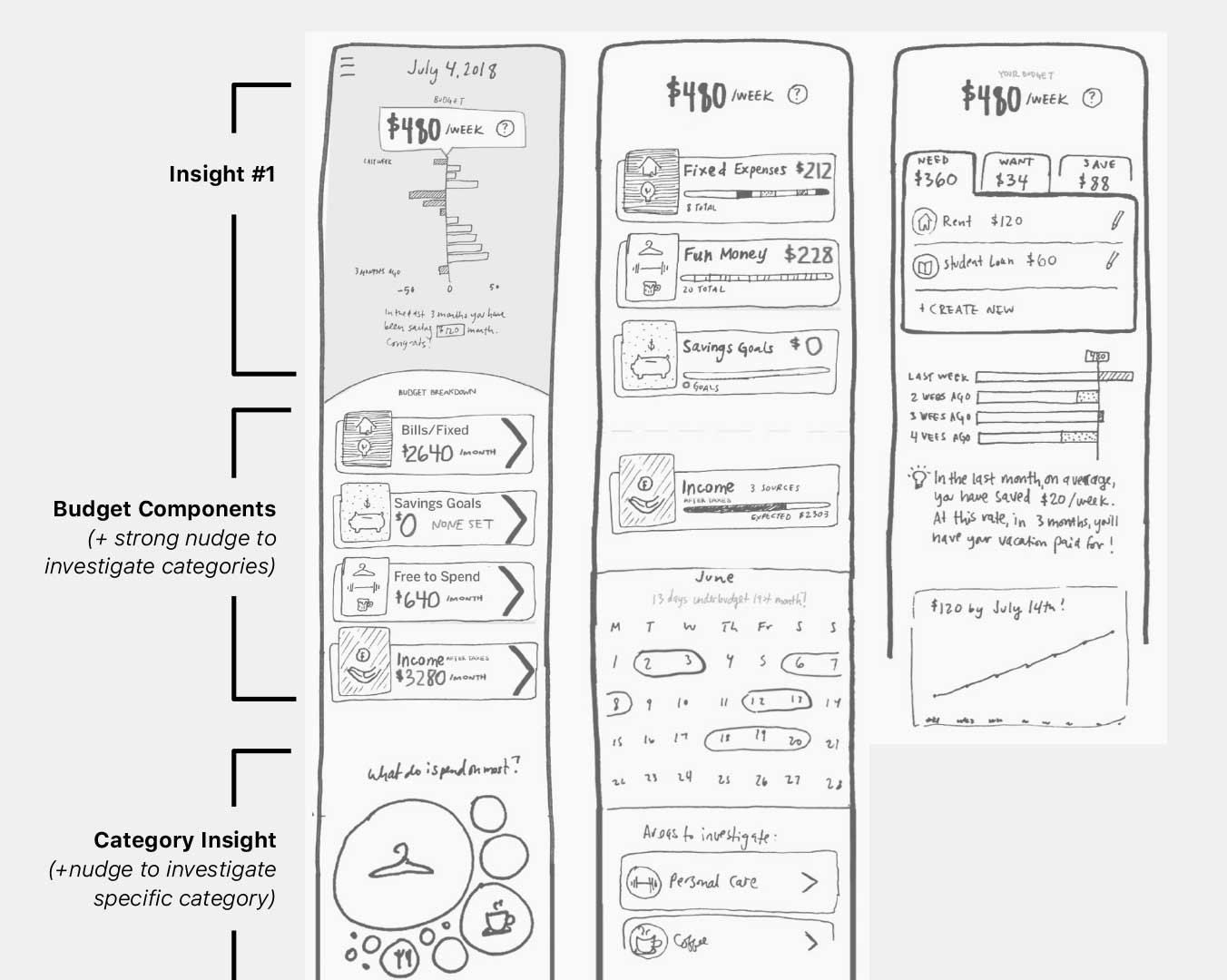
Sketches / Interaction Model

What interactions will be most intuitive to our users, making the content most digestible, yet still creates room to add our unique brand to it?

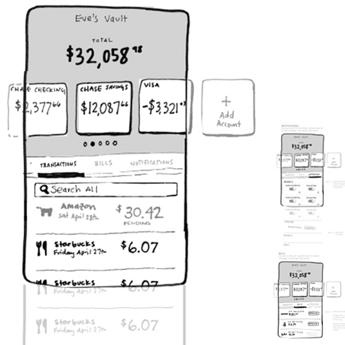
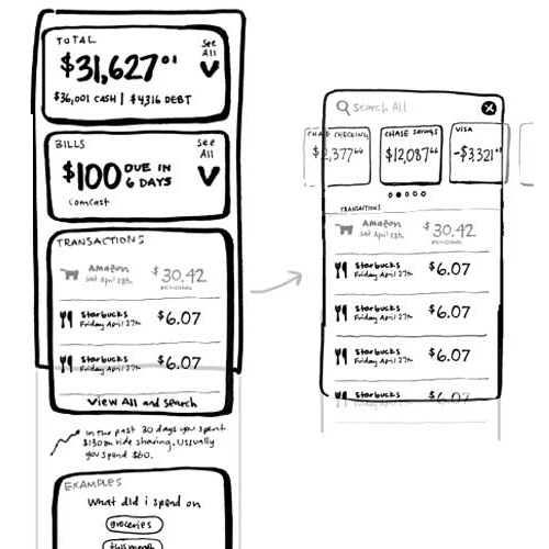
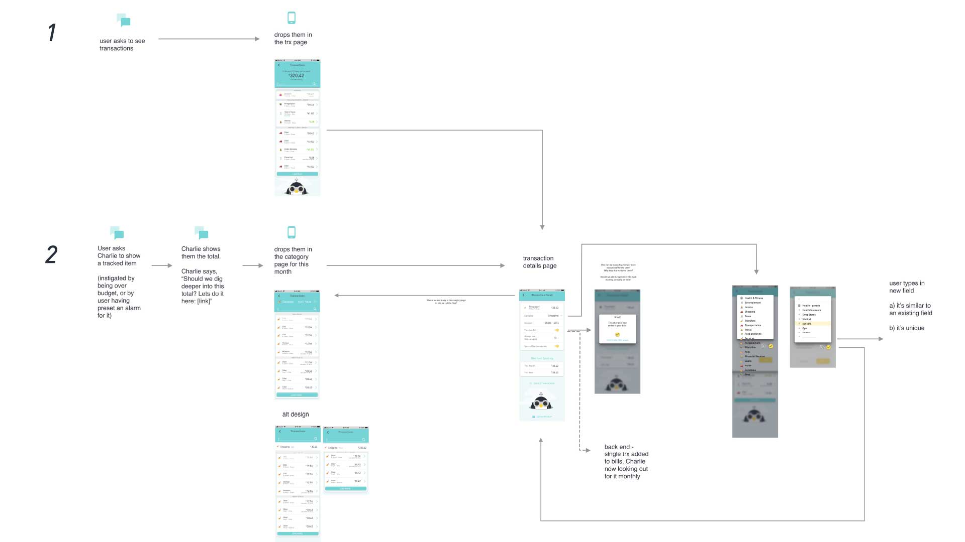
We started by exploring many interaction models in whiteboard form, narrowing it down to four.

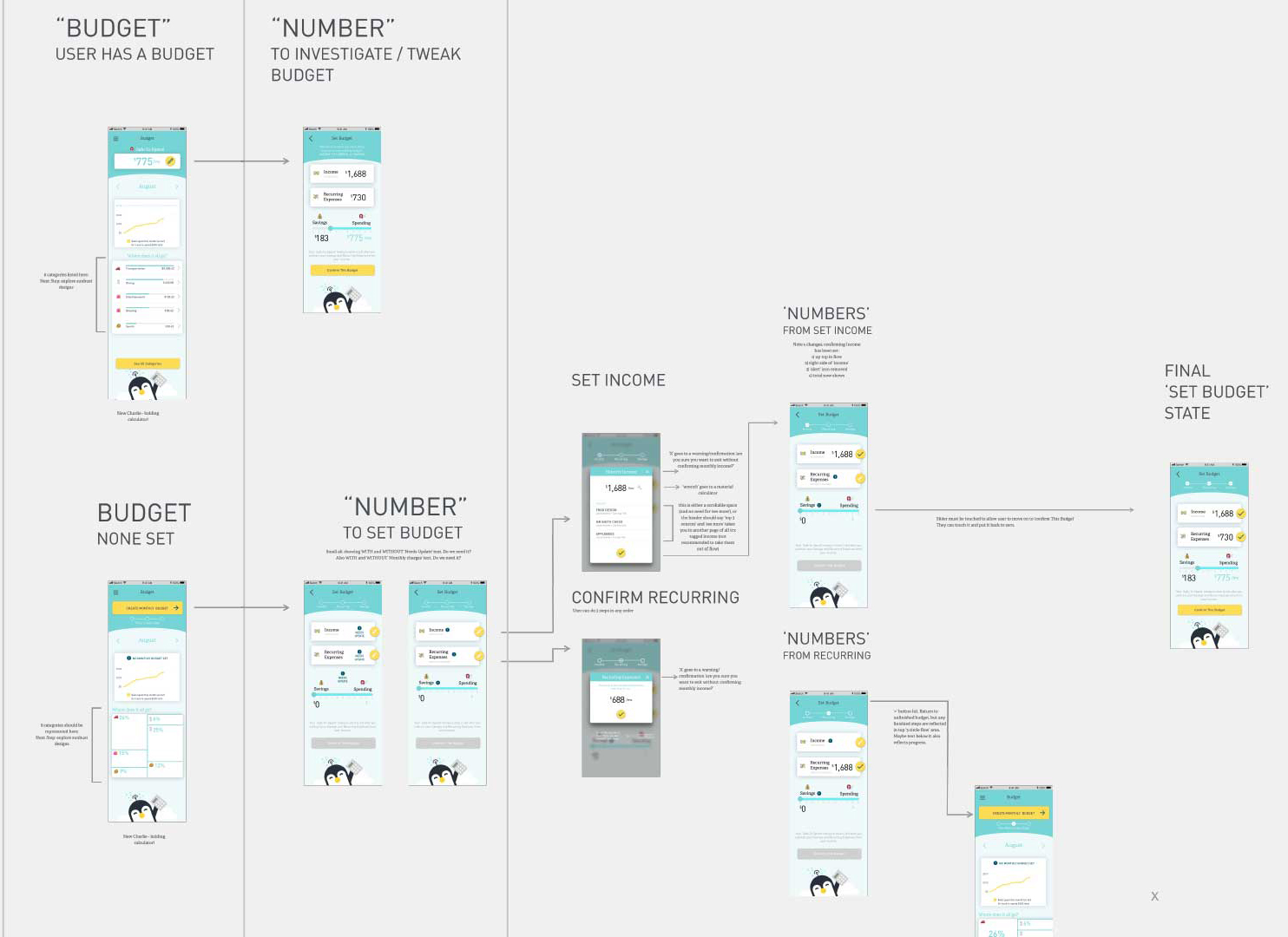
Wireframes & Testing

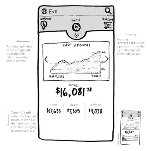
After choosing an interaction model, we tested wireframes on a small cohort.
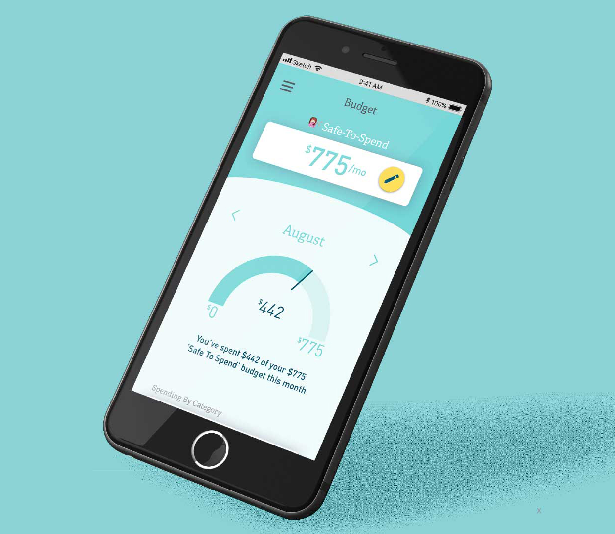
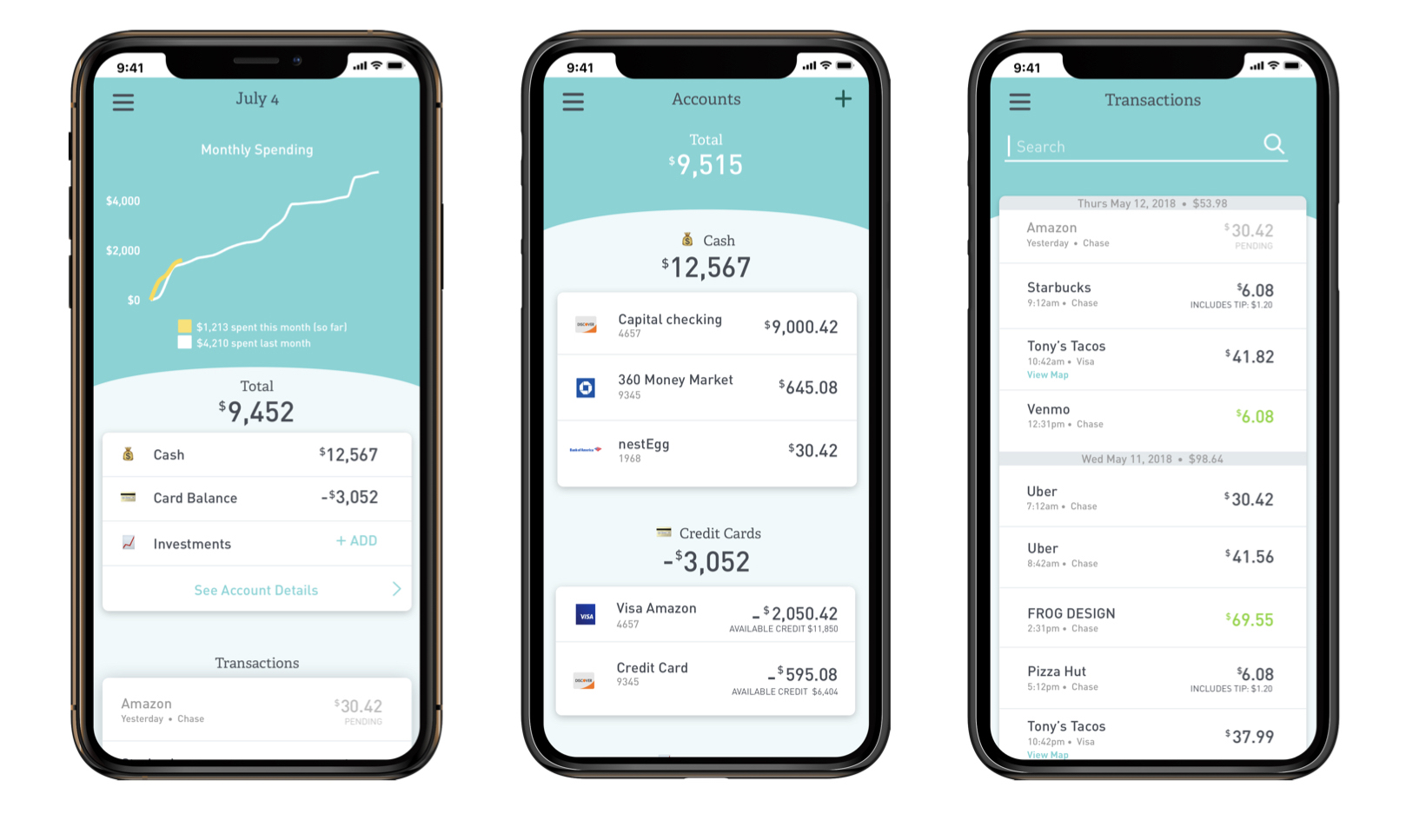
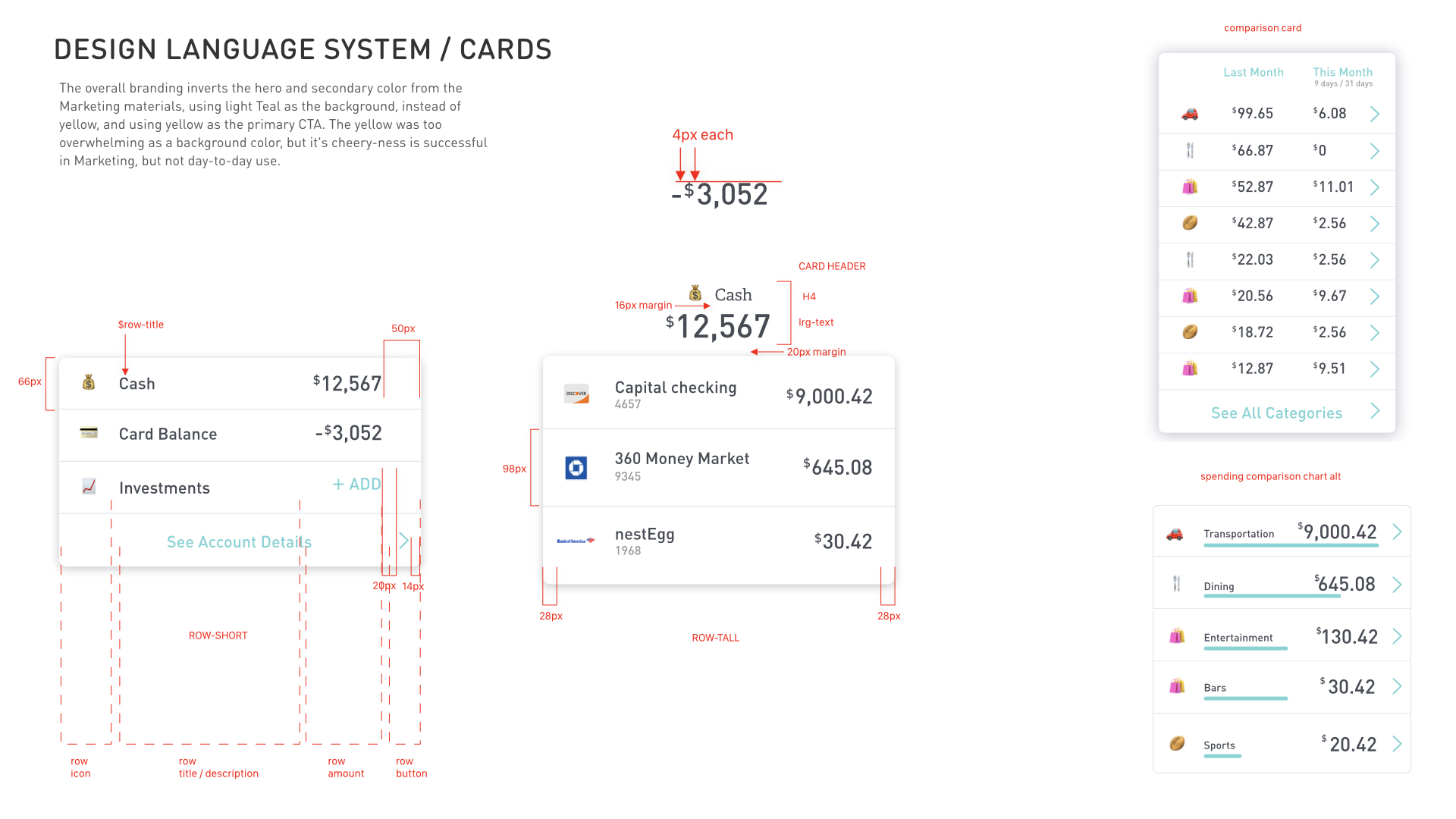
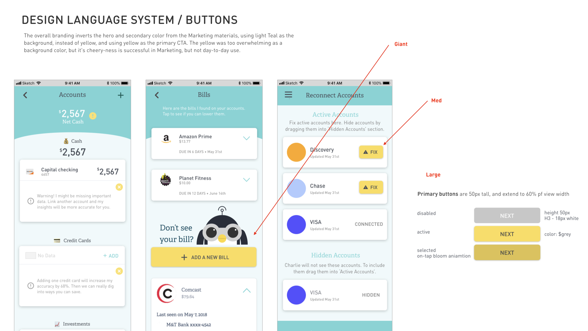
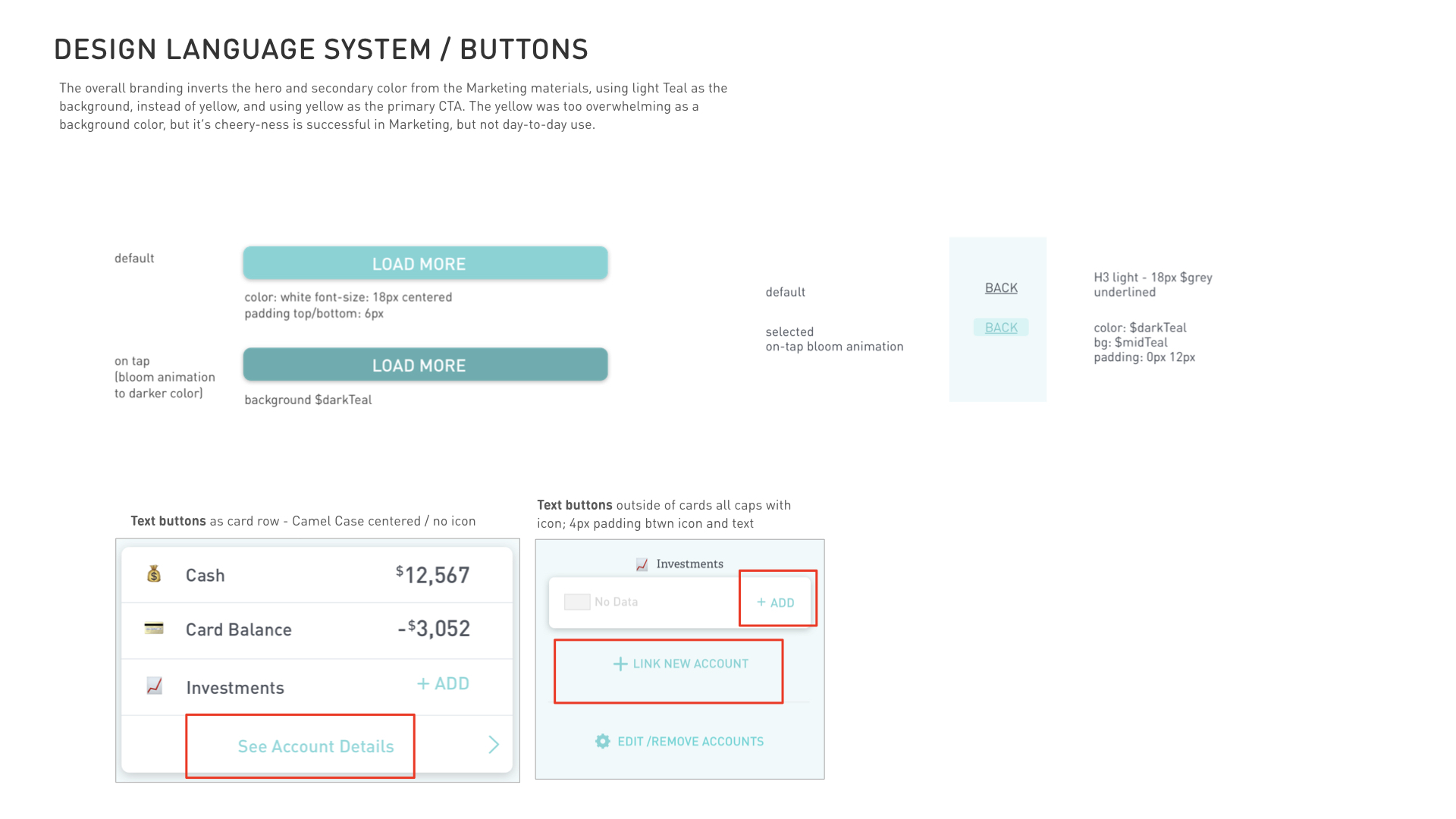
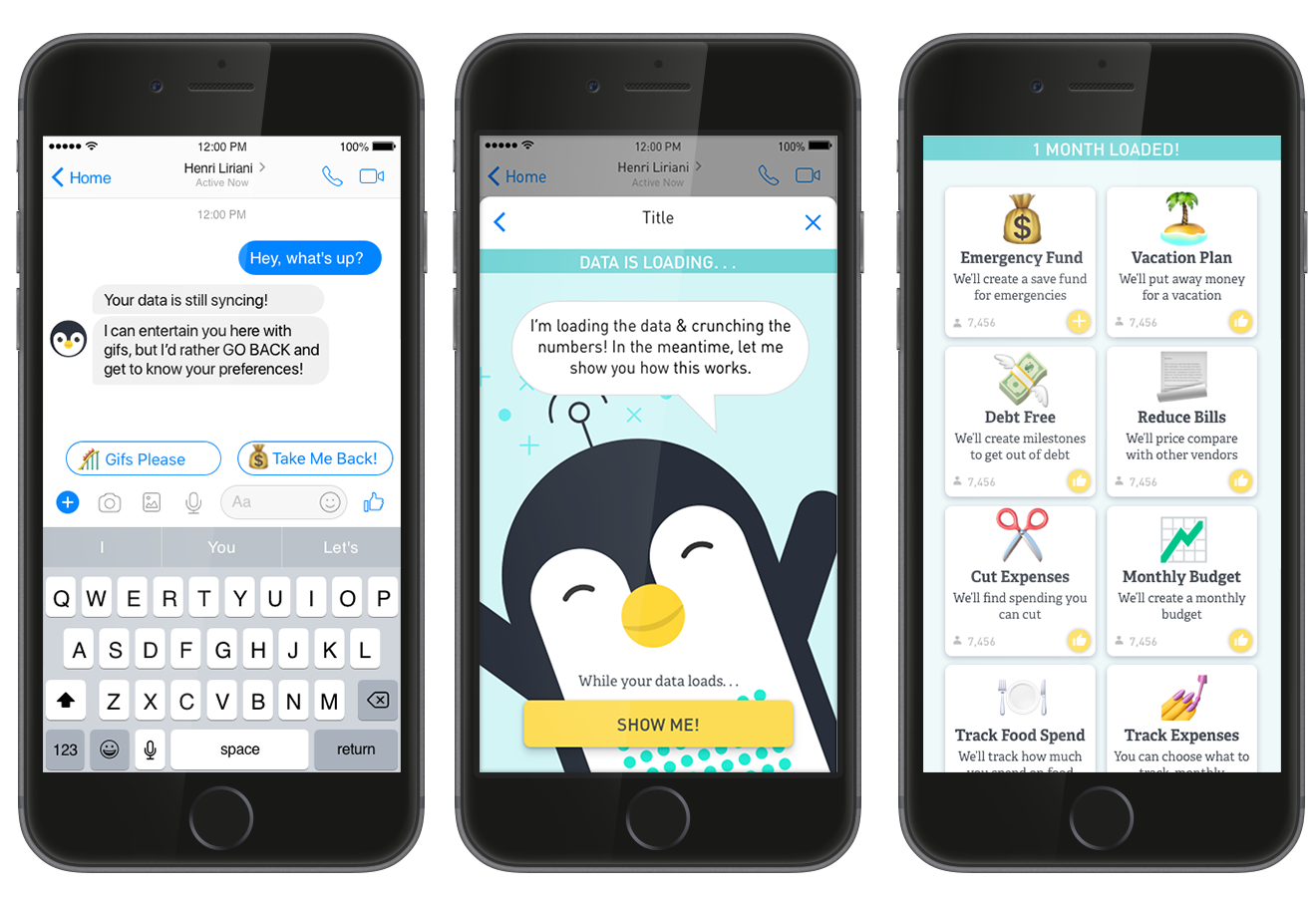
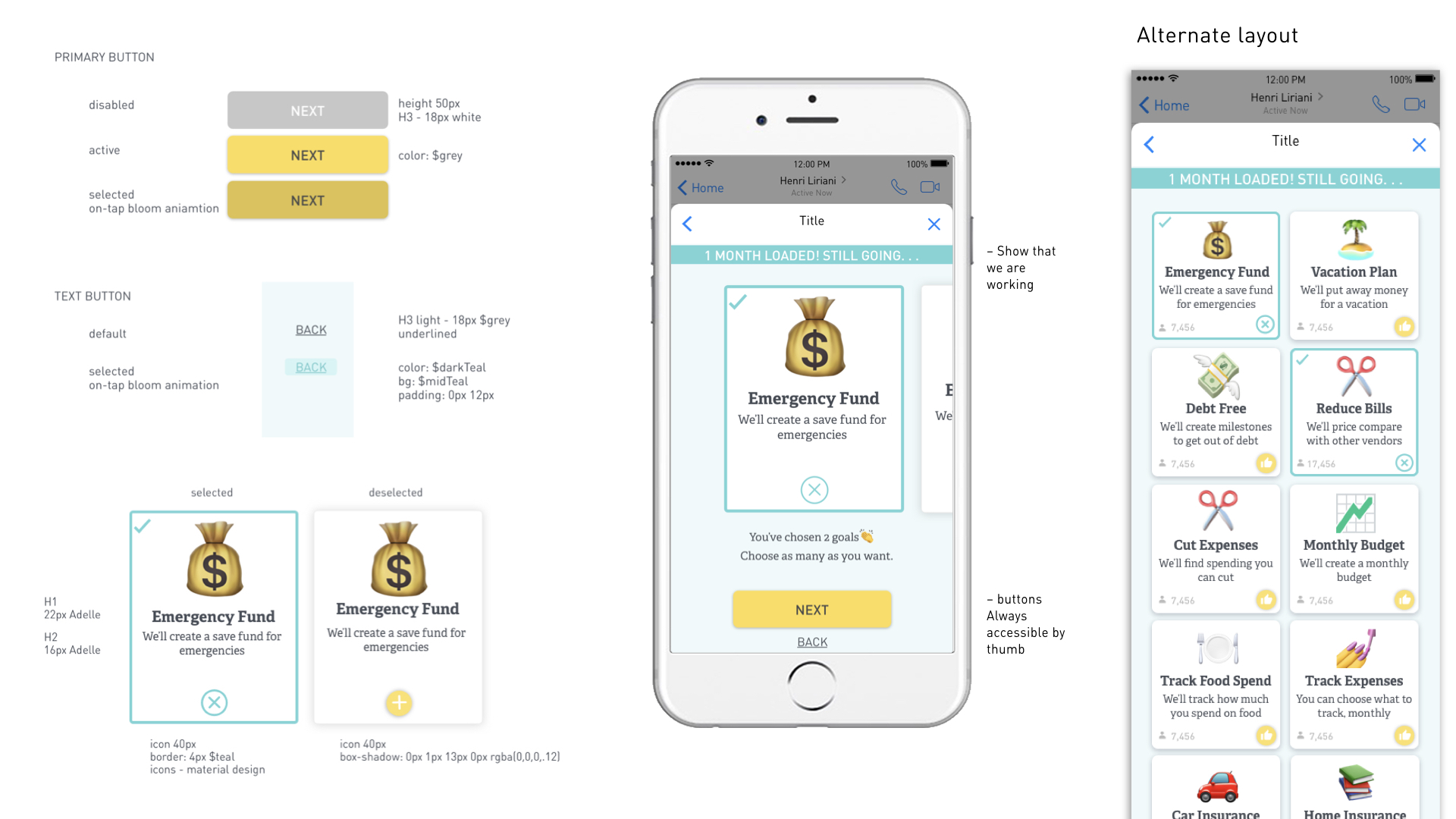
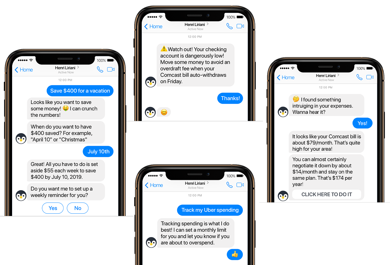
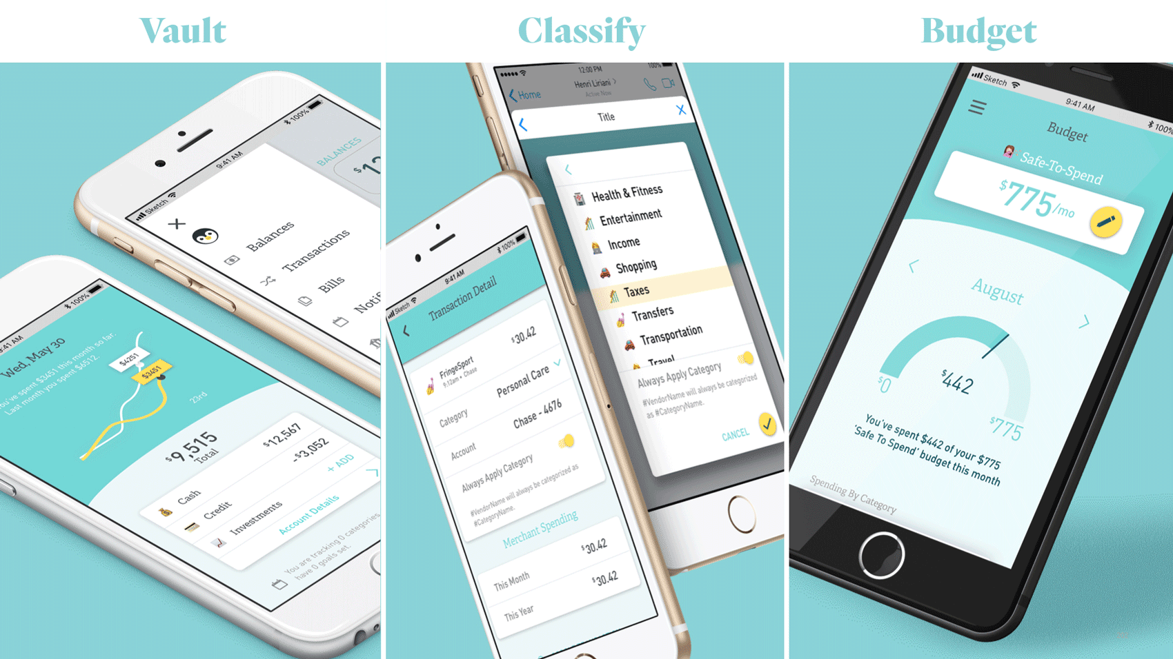
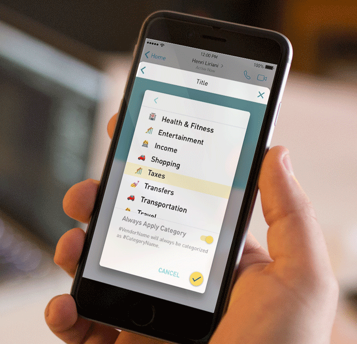

Final Designs

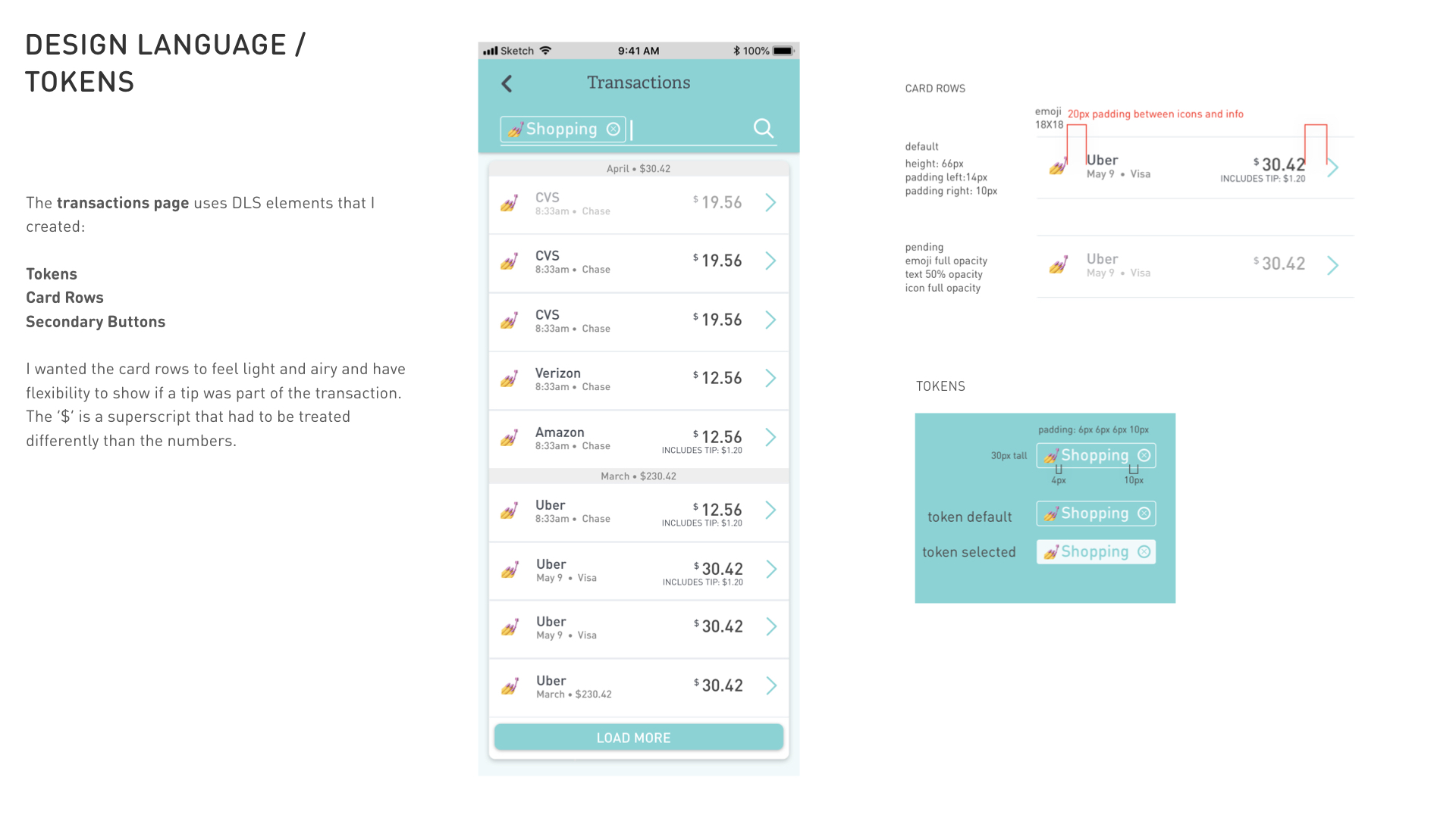
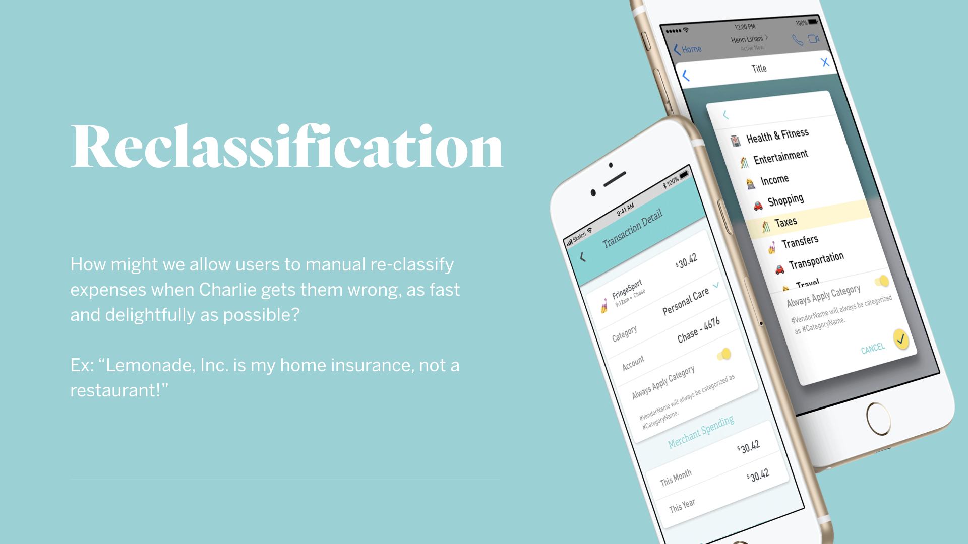
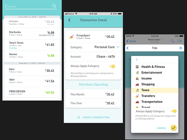
Using a human-centered design approach, we designed and tested in agile rounds, showing designs to potential users for usability testing and feedback. Interally we ideated along the way on UI, UX, data visualization, and more.

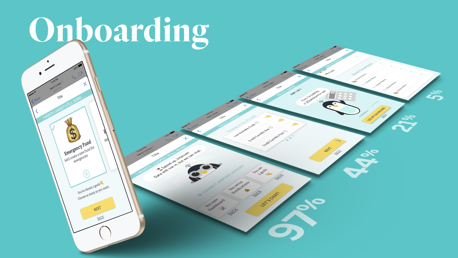
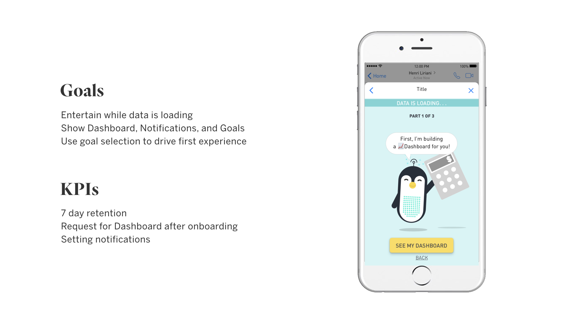
Develop / Feedback / Iterate

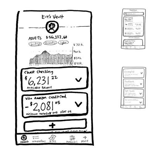
Working closely with the development team, we iterated on designs as needed, launched, collected feedback, and continued to respond to feedback with more iterations throughout the next few cycles.

Sketches - Final Four Ideas

Horizontal Wallet

Pro: First glance clear total. Con: Alot is buried with no navigation.

Cards / No Nav

Pro: First glance places an equal hierarchy on total, bills, and transactions. Cons: Could become an endless scroll.

Three Option Nav

Pro: simple discoverable with a fun custom animation that could be sticky. Con: Some key interactions are buried below the top 3.

Bottom Nav

Pro: Sections are proven to get more interaction here than inside a hamburger menu. Con: Limited for new features; they might all get nested into 'more.'

Final Designs

Working in design sprints, then dev/design sprints, we created the mobile experience in a matter of weeks. Using material design and a light design language system we were able to move quickly, and get our validated designs into the hands of more users for feedback, pretty fast.


Empty Data States


More details about the process of creating this project are available upon request.

Project 2 - Reclassification Flow

Problem

After launching mobile, we discovered that users love how Charlie automatically categorizes their transactions, but he's not 100% accurate. For Charlie to be their single-use banking product, they have to know that the data is accurate, and they are willing and eager to recategorize it themselves. This was the #1 most requested feature.

Opportunity

How might we allow users to correct Charlie's mistakes as easily as possible? Working with a developer, we analized the user data to help inform what the most common errors were. We interviewed a few users, then went forward with a simple deisgn.

Designs

Working 1:1 with a developer, we cranked out a solution in a few weeks, working through hero paths and edge cases.

Measure

We developed a roll-out strategy to track success. First we pushed the feature only to those who requested it, following it's annoucement up with a survey. After analyzing the responses, we pushed to 100% of users, 5% of whom received a survey request, 10% were asked for in-chat feedback. Then we quickly began speccing a second iteration.


User Flow

Identifying our top 2 entry points to reclassification, we pushed users to the new flow from both.


High Fidelity Prototype

We decided to create a high fidelity prototype, then validate the usability of the UI with a handful of users. That led to minor refinements, then we released it to only the users that requested it, tracking success by asking for feedback (qualitative) and by analyzing behavior (quantitative). Interactive prototype created in Principle for mac.

Project 3 - 'Create A Budget' Flow


Sketches

In a low fidelity format, we decided as a team what the most important information to show was, and the most delightful, on brand, way to show it.


User Flow

Leveraging a few common economic budgeting models, we created our own variant, guiding a user through thinking about their budget. The two main flows were 1) set up budget for the first time, and 2) revise budget.

Project 4 - Onboarding


Process

Focusing on every friction point of the conversational UI to the mobile experience, our goal was to reduce churn at every point in the funnel. After analyzing the current data, we identified a few moments, developed some hypothesis, interviewed some users, then developed a new user flow. The flow had to succesfully take a user through installing the chatbot, creating trust, getting the user to connect a bank account (or a few!), and getting them to their 'Aha' moment, fast.

A few other goodies


Blog, Affiliates Site, Landing Page

Throughout the year we had constant iterations on these 3 sites. These sites were mobile first, but designed for all breakpoints.


Conversational UI

Charlie's main medium is chat. The mission statement of Charlie Finance is to make Americans feel at ease and in control of their finances. We believe that chat, as a medium, allows us to do both of these things, while gaining trust and rapport with each individual. Designing conversational UI was a challenge and extremely fun.


This was a year of fun & fast paced work, rolling out stories and features iteratively. Concurrently to meeting user needs, I was developing a DLS and evolving the app from a chatbot inside FB messenger to an independent mobile app.