As fulltime product design lead, I led design exploration, customer interviews, scope iteration with engineers, and stakeholder expectations, for two quarters worth of onboarding iteration.

We worked from tightly scoped KPIs and data-driven insights to finess our onboarding funnel iteratively.

Role

Head of Product Design / Solo Designer & Researcher

Product

A desktop email app for teams, allowing them to assign emails to each other, track when they're online, view email metrics, and write interal notes.

Most Proud Of

Approaching a very large problem statement with prioritized tractable stories.

Phase 1 - Define the Problem & Success
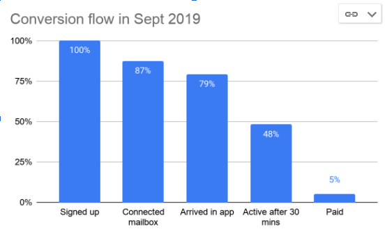
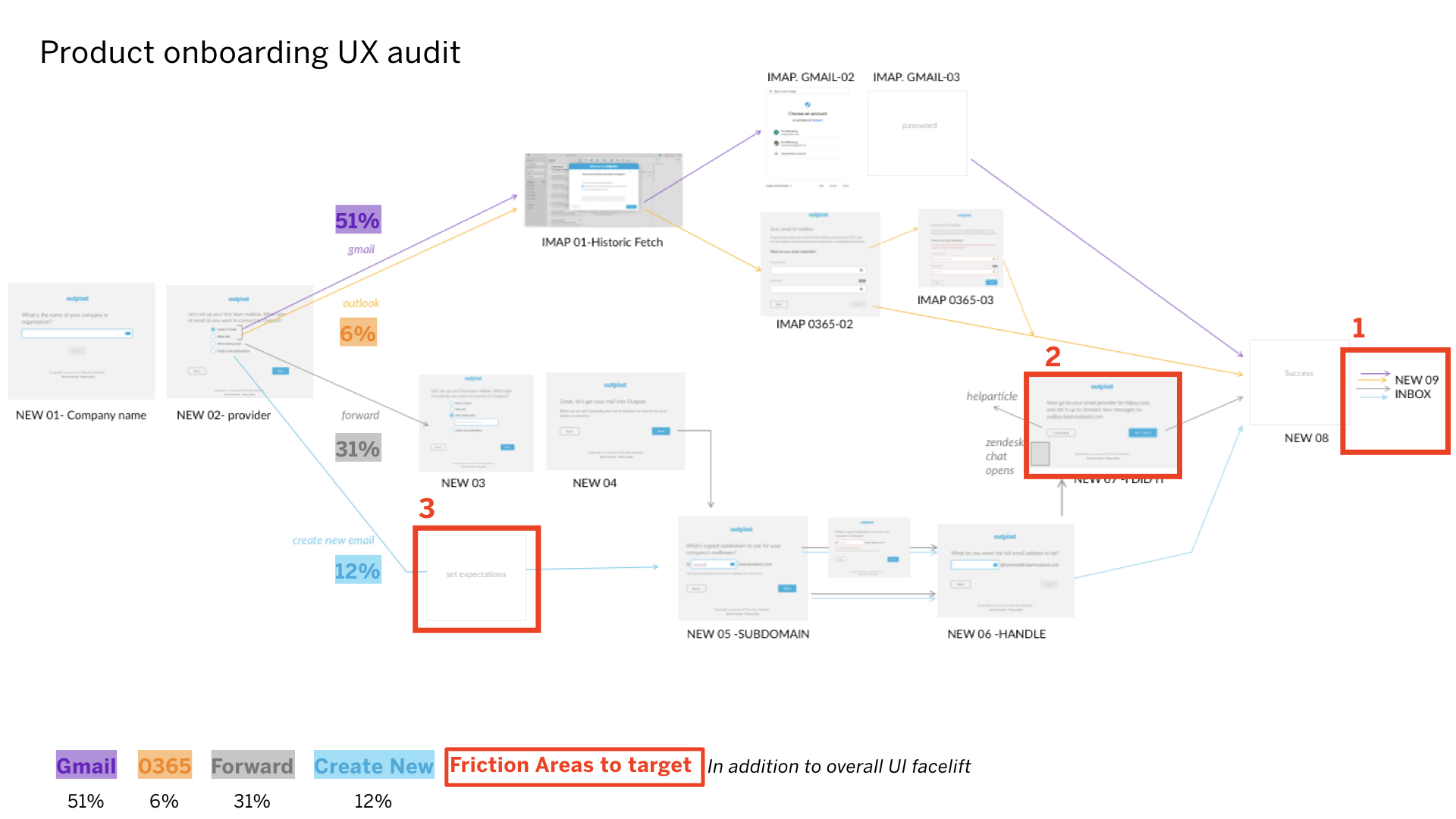
Funnel dropoff data

In looking at our onboarding funnel data, we have drop off rates at 5 major steps.


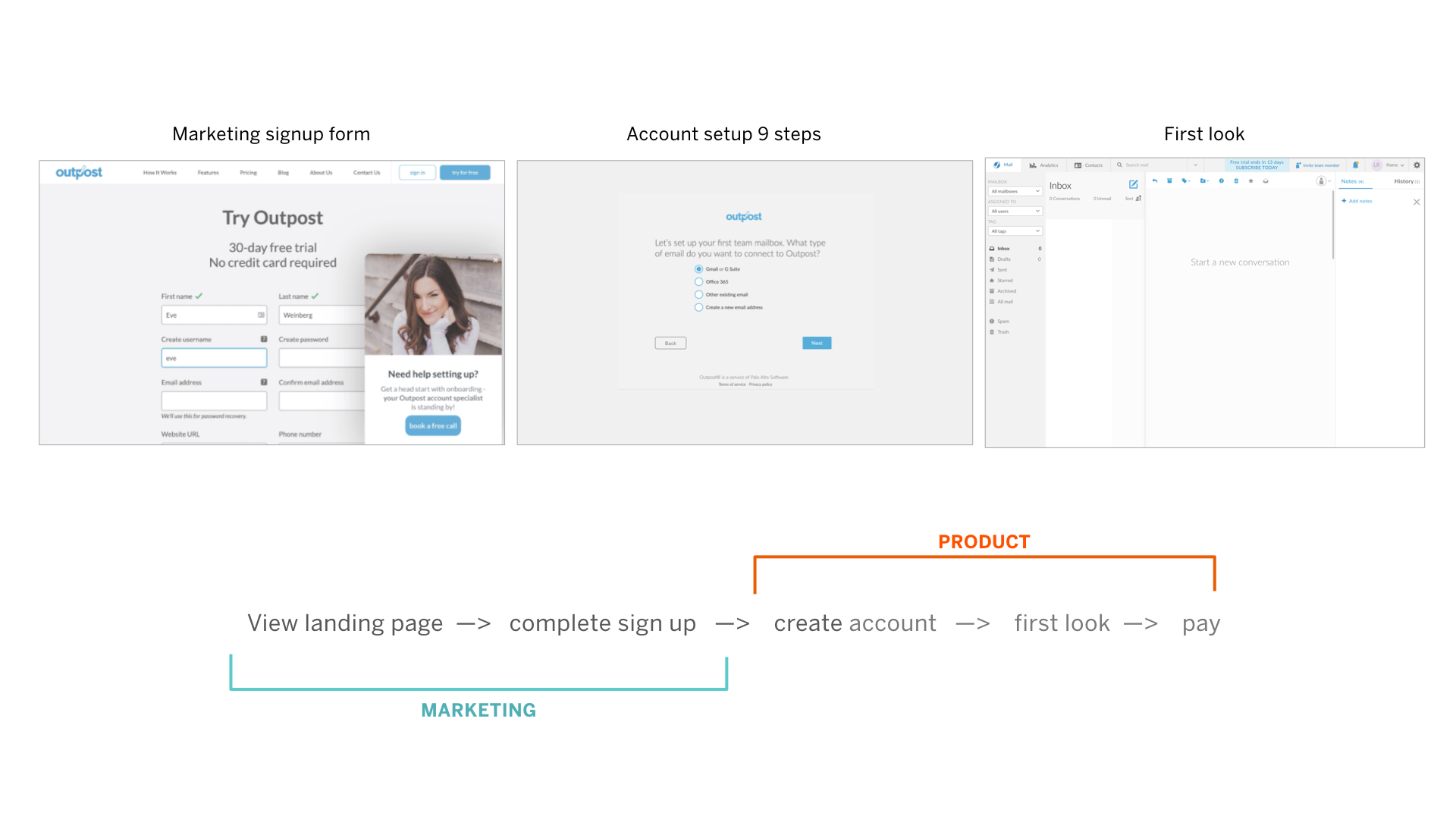
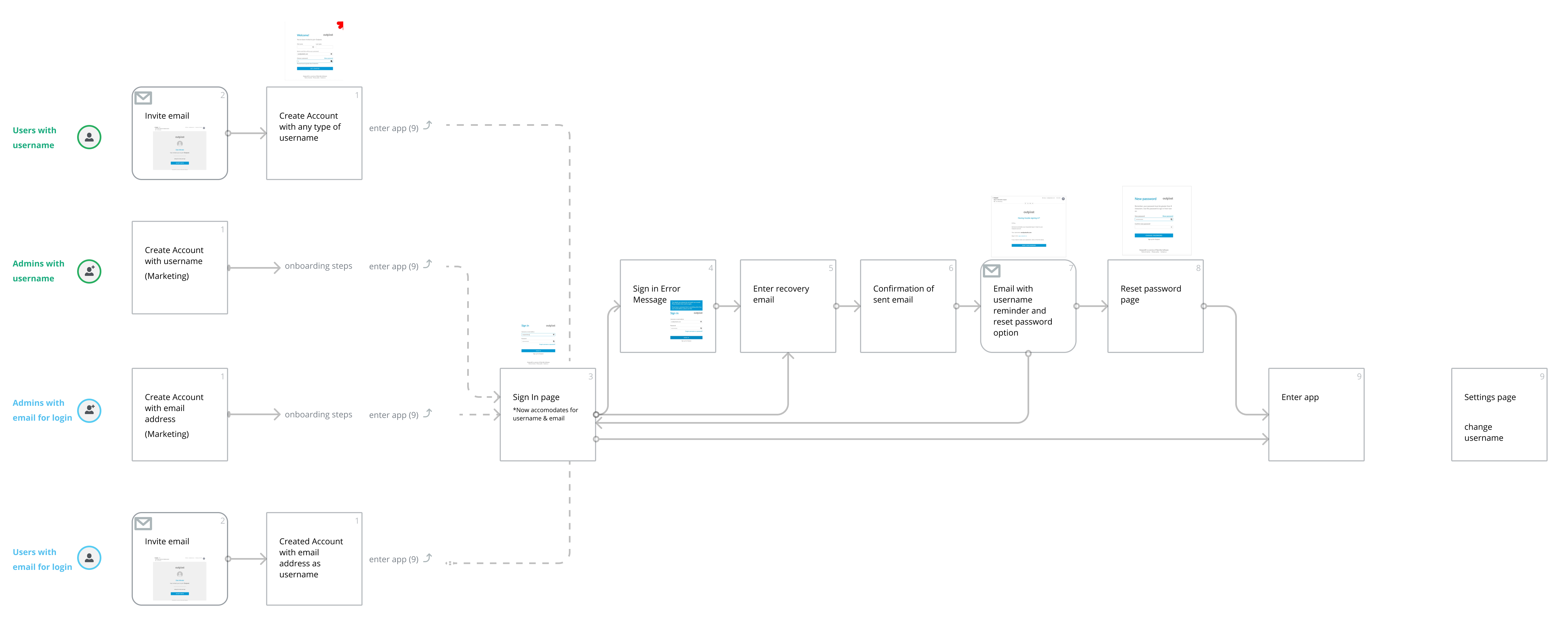
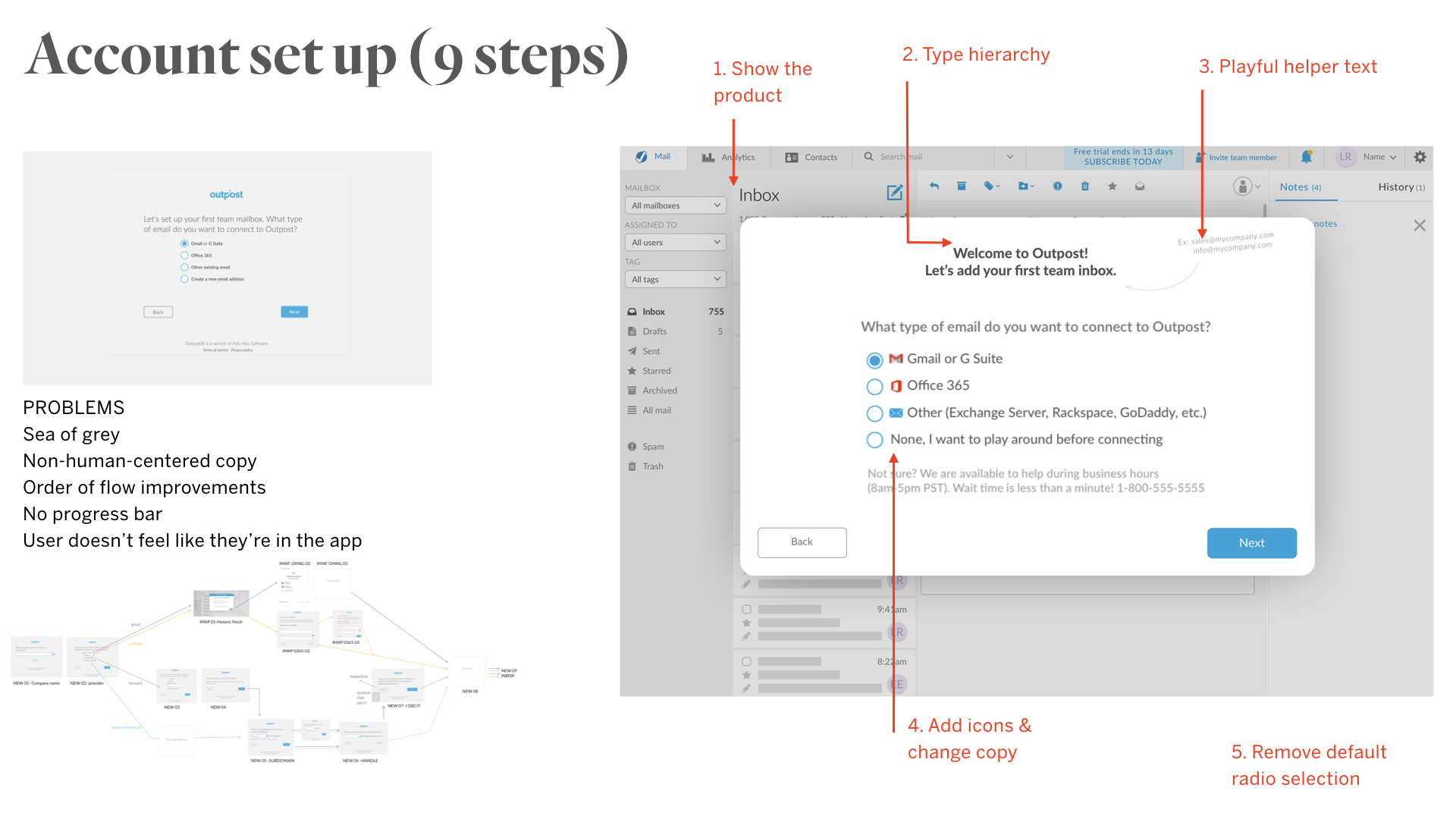
4 user paths - 1 persona

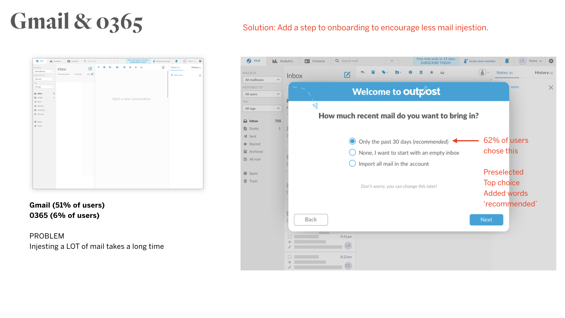
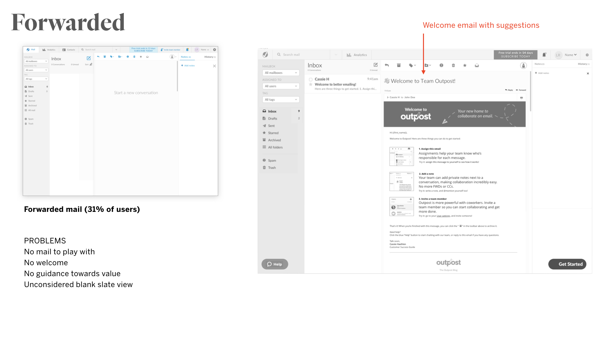
We also have 4 different user flows to focus on, for users that self-select to connect 4 different types of existing email boxes (Gmail, 0365, Forward mail, or create a new mailbox with us).


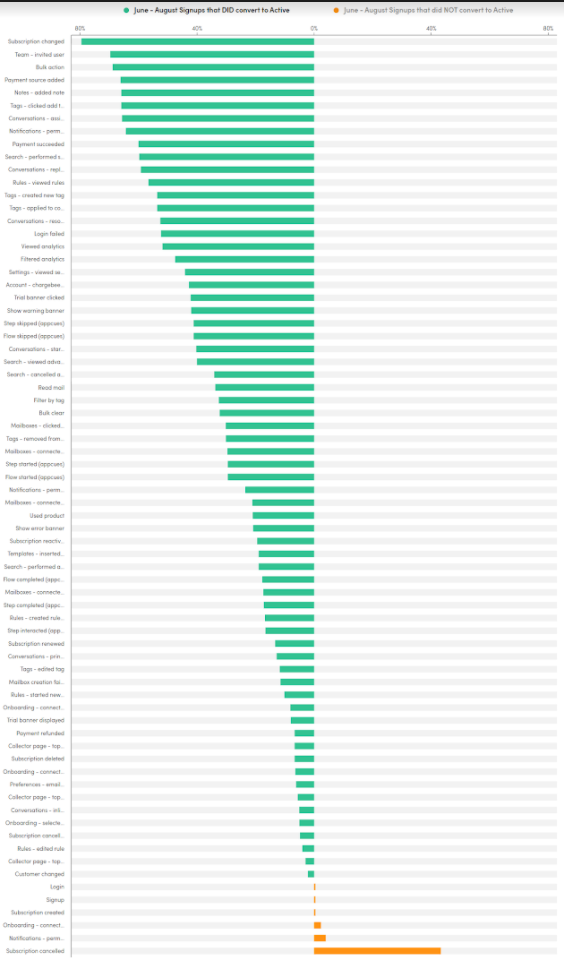
Correlated user actions

What actions correlate highest to conversion? What actions correlate highest to leaving immediately?
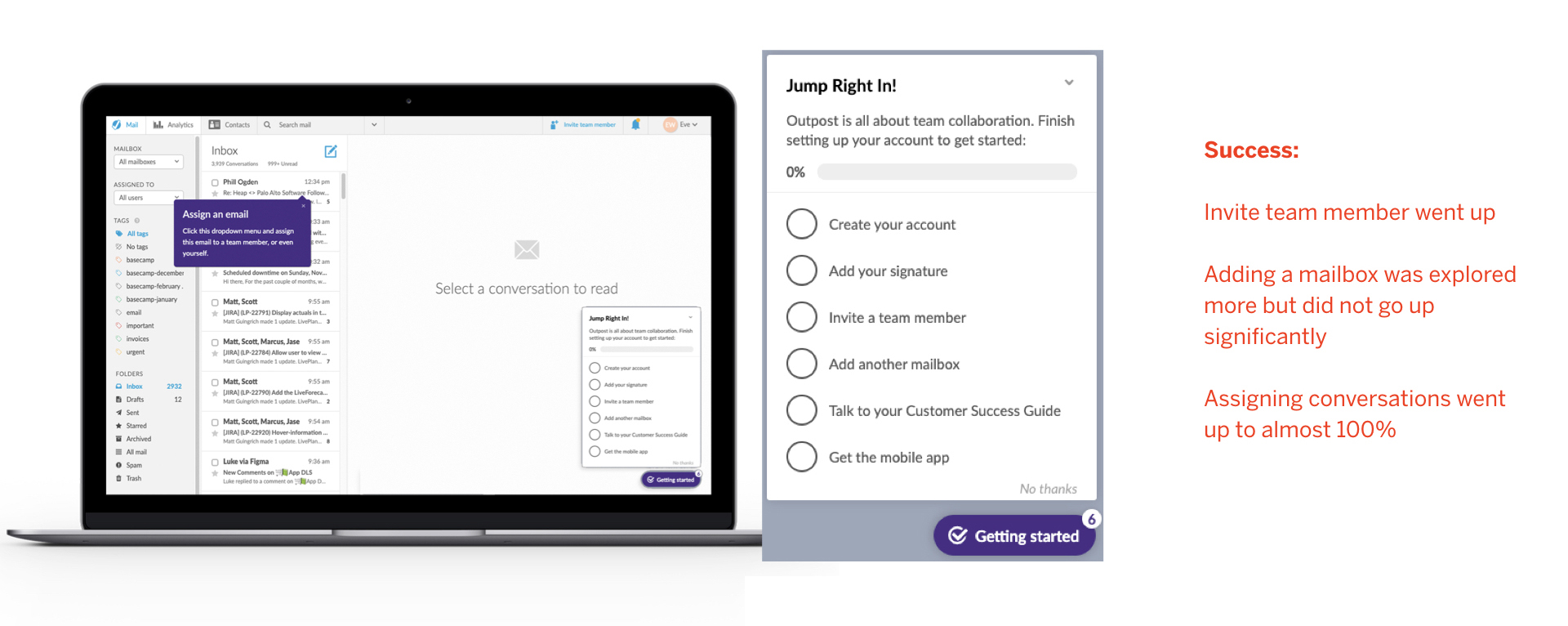

Metrics for success


1 - Convert trial users to paying from 5% to 8%.
2 - Number of users that connect more than 1 mailbox (21% to 30%)
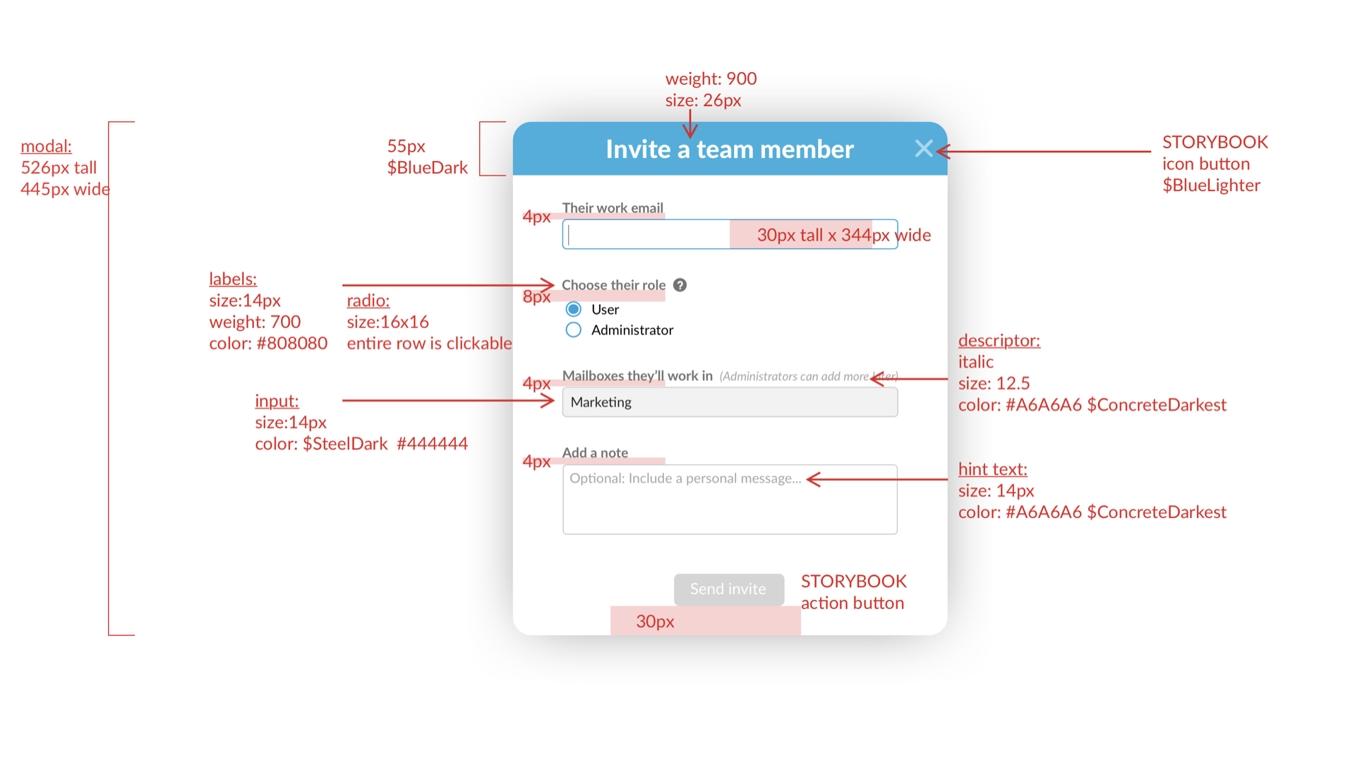
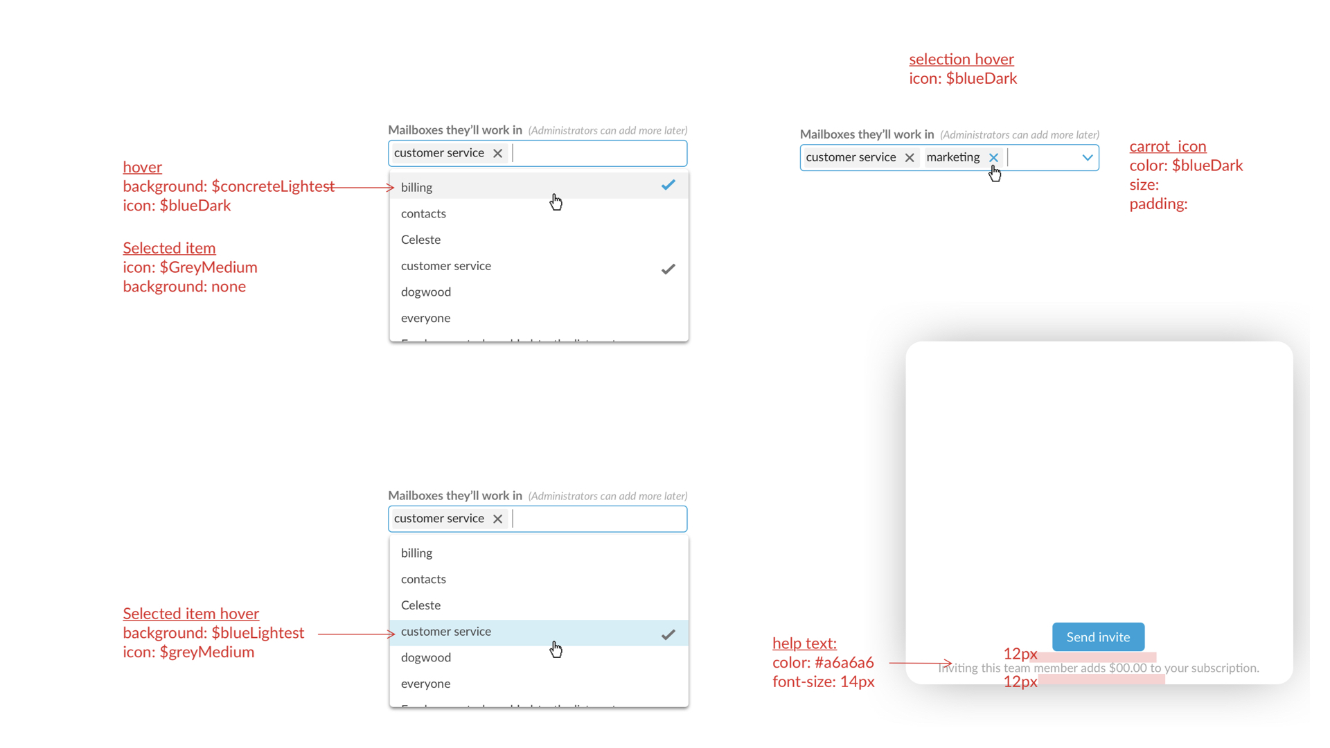
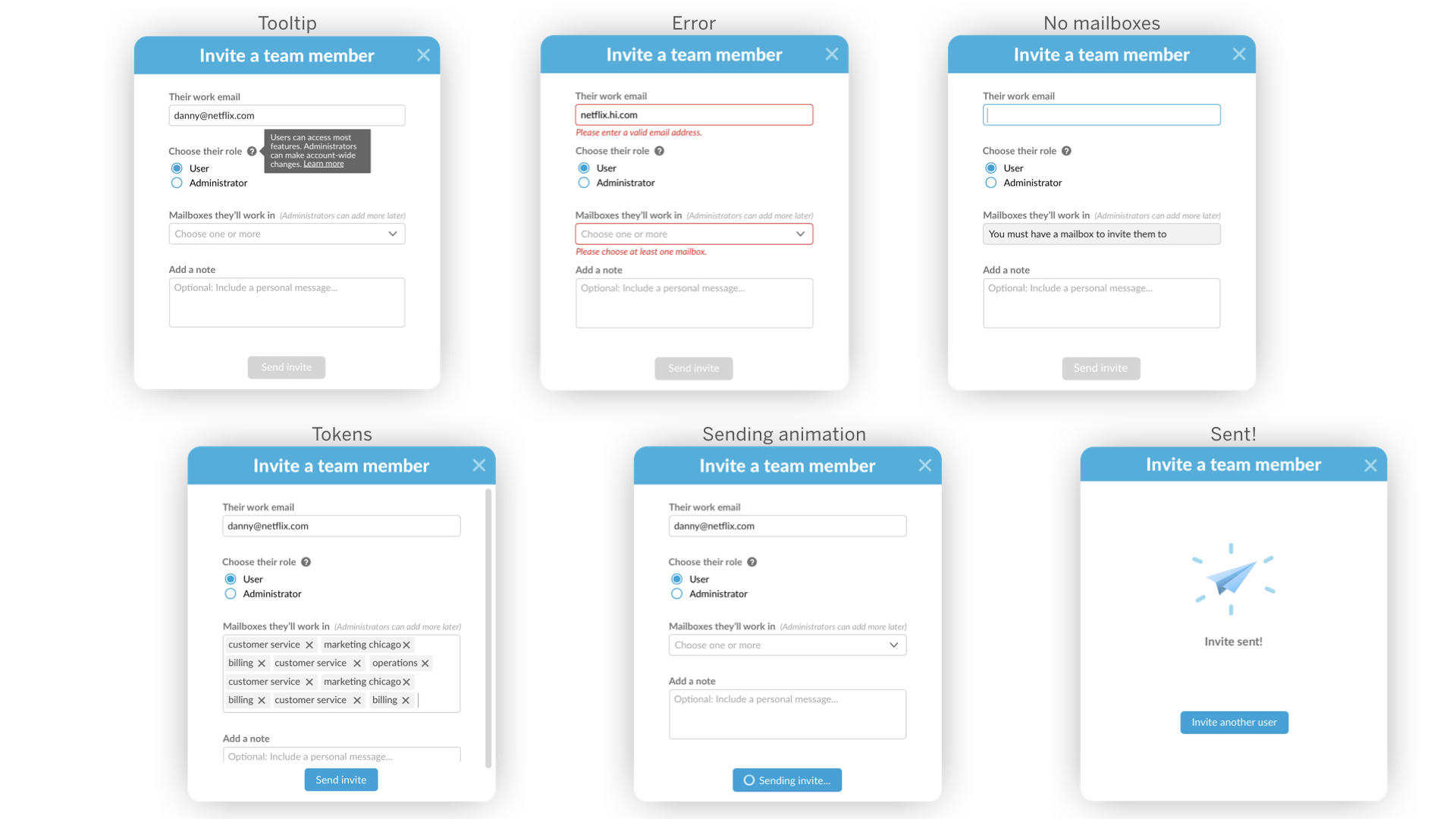
3 - Number of users that invite a user (10% to 40% - bonus if it's not themselves)
4 - Number of users that assign a conversation (14% to 30%)

Phase 2 - UX audit

Audit of UX flow

Find friction areas, both from a heuristics/usability standpoint, and a confusion standpoint. Each step of the way, asking 'Do I have the information I need to complete this step? Am I motivated to complete this step? Am I delighted when completing this step?'


Audit of UI

I conducted a personal onboarding audit myself and document my thoughts.


User testing audit

How do users perceive the brand? How easy or hard is each step? This data is best captured through tools like TryMyUI or video follow-alongs in realtime during signups. I wrote the questions and synthesized the data.


Insights

People who leave do not engage with the collaborative features; people who engage, stay do.
Bulk action is the top indicator that someone will convert because it implies that they’re customizing their environment. Replying to an email is the 2nd. Viewing settings is the 3rd.
Many people send an invite to themselves and gut check Outpost by testing the receiving of this email - how it feels, what it offers, what it looks like, etc.
It’s extremely rare for users to start new messages.

Phase 3 - MVP Opportunity Areas

We identifed and prioritized the top 3 areas of focus on for an MVP, first pass at revising our onboarding. We ideated wider, but then scoped down to some mid-low hanging fruit.


Sign up form


Exploration & Considerations

We considered the Admin persona for this step, as users get invited and never see this page. We asked which form questions we really needed and why. Do users misspell their email enough to ask for a confirmation email field? Do users get less confused if we ask them for a username instead of email address as username? We played and tested field header copy a lot as well. We a/b tested every 2 weeks.


The Winner


Can we change login from email to username?

We wanted to test changing the admin's login to a username instead of an email address. We used this flow chart to assess the engineering effort on that choice.


For continuity, roll it out for pricing page as well


Solution 2 - Invite User Story


Invite User Story

Highly correlated to conversion, the experience of inviting a 2nd user was one that we wanted to be highly discoverable, and extremely delightful. Here is our final solution.


Redlines

We introduced new design language to complete this feature. We created a multi-select dropdown as well as set new animation styleguides for our modals.


Final states of the form


Success

65% of users that invite a 2nd user, do so through this form. And the number of users in trial that invite a 2nd user went up significantly.

First Look in-app guidance

I led a workshop with my team, educating them on all the UX patterns we could choose from. We idaeted on the pros and cons and prioritized on an impact to effort scale.


Medium article

I found this to be so helpful that I wrote an article about it ;) Enjoy it here.


After brainstorming the impact to effort on all the possible patterns, we decided to start with an extremely low effort version - the checklist. We did this with a 3rd party app so we could iterate constantly, learn, then decide to build something more permanent and robust later.

The 2 quarter epic proved to be succesful and small iterations were the name of the game.

We will circle back to this work after making some features!