As fulltime product design lead, I led design exploration, customer interviews, scope iteration with engineers, and stakeholder expectations, for this key feature and epic in our app.

The sidebar was under-utilized because of it's UX friction and lack of value <> real estate ratio.

Role

Head of Product Design / Solo Designer & Researcher

Product

A desktop email app for teams, allowing them to assign emails to each other, track when they're online, view email metrics, and write interal notes.

Most Proud Of

Iterating on a feature with extreme engineering constraints and a work-in-progress DLS.

Phase 1 - Define the Problem

Problem

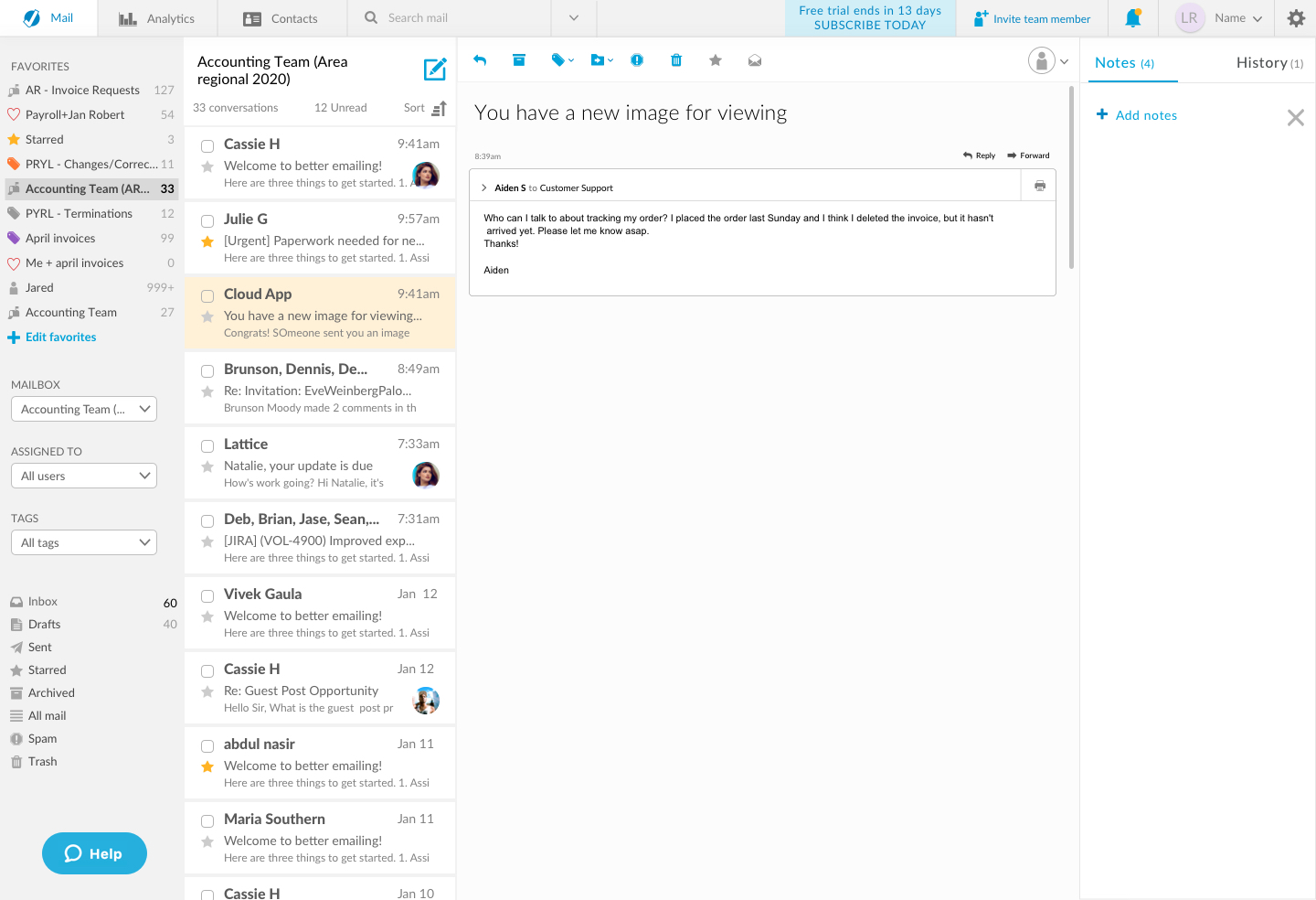
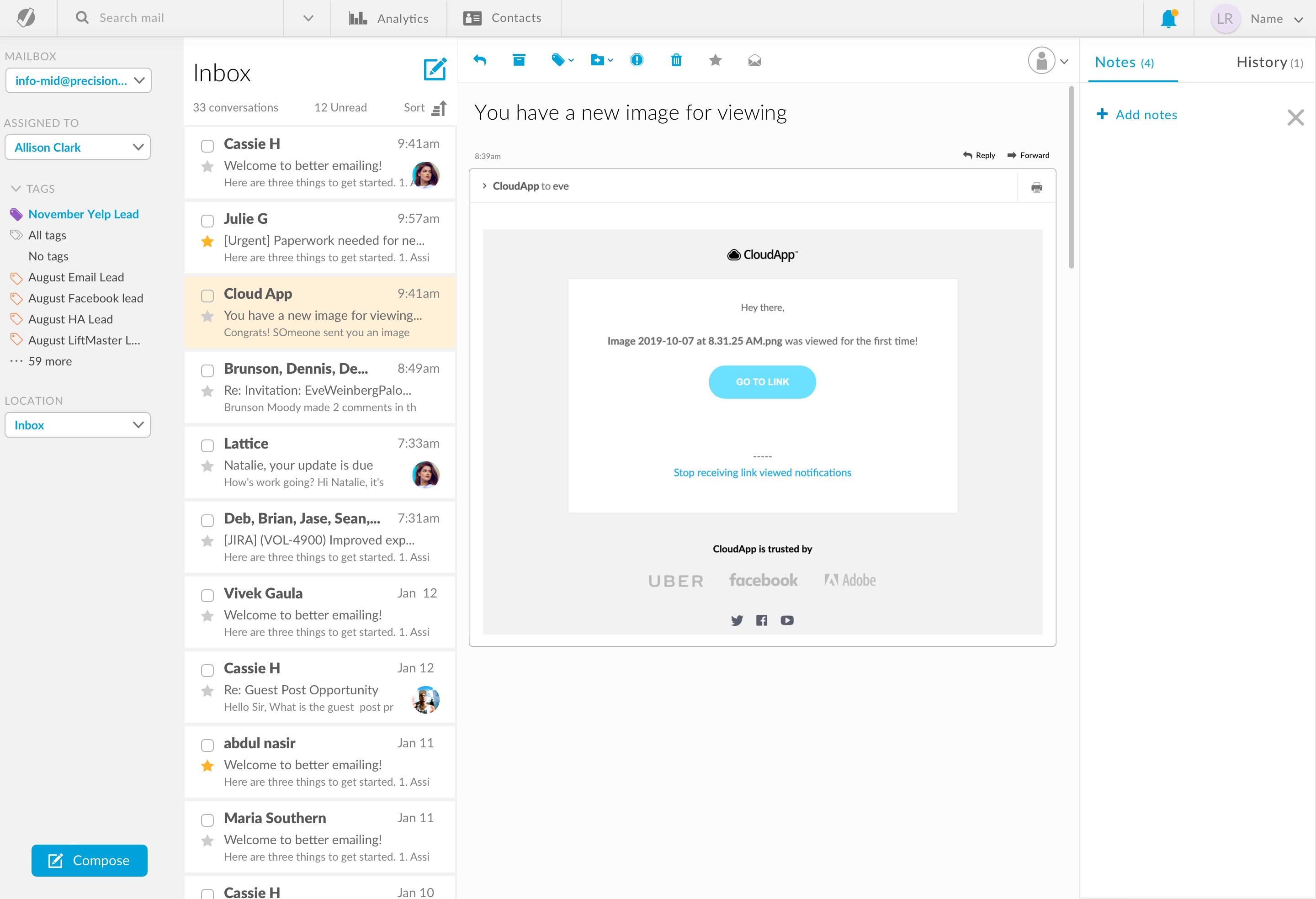
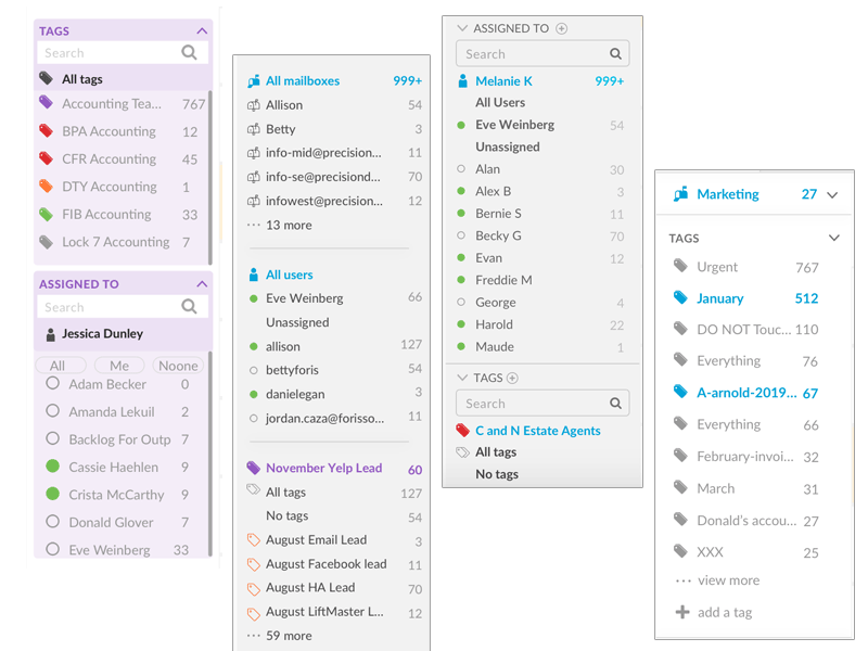
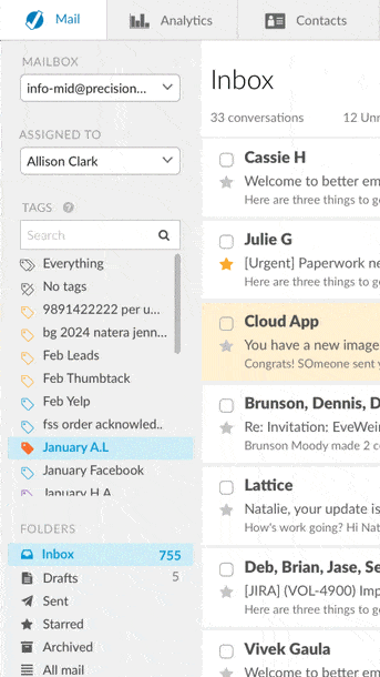
Current users' efficiency relies upon seeing important email metrics at a glance, or with less clicks. 
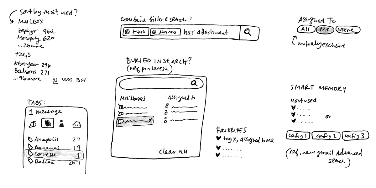
Specifically, they want to be able to tell how many unread messages are in each mailbox, whether a user is online, balance of workload, and less clicks to filter by tags. 
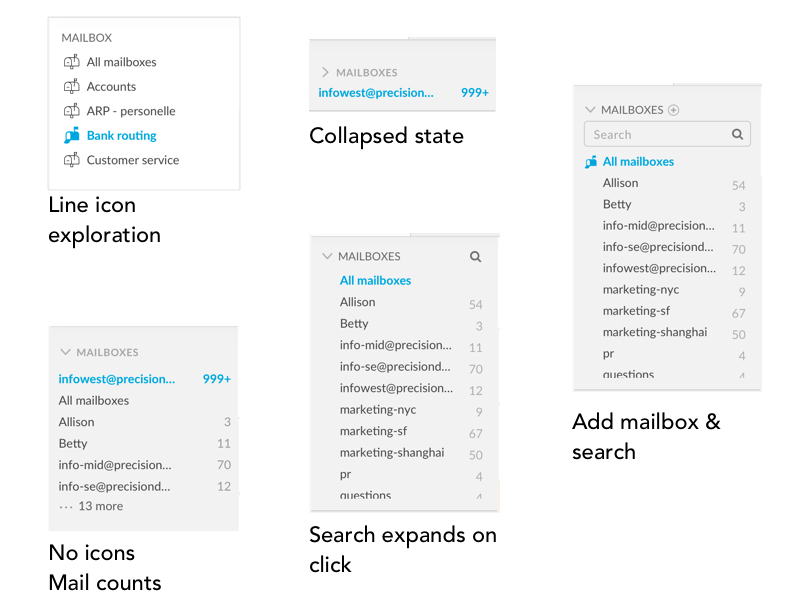
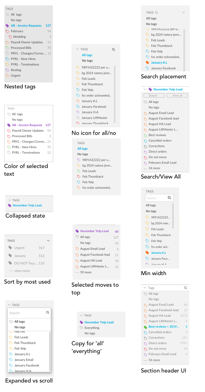
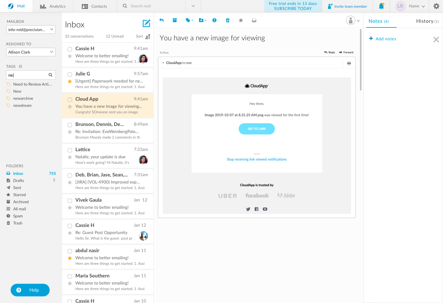
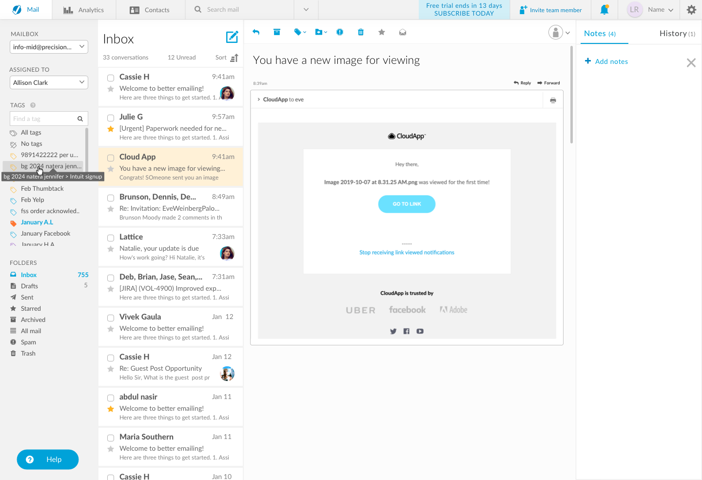
Currently this is all hidden behind filter dropdowns, impeding the users’ efficient use of the product. 
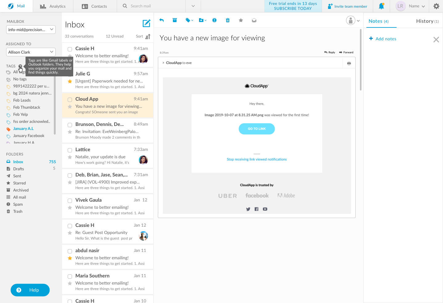
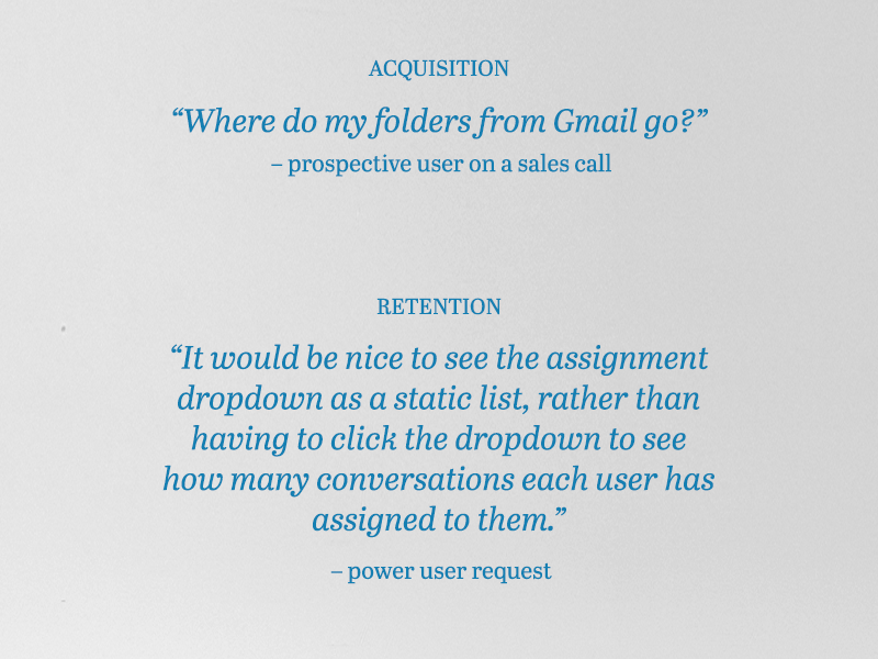
Prospective users fail to see the value of the filters, especially tags, because they do not understand how they work.
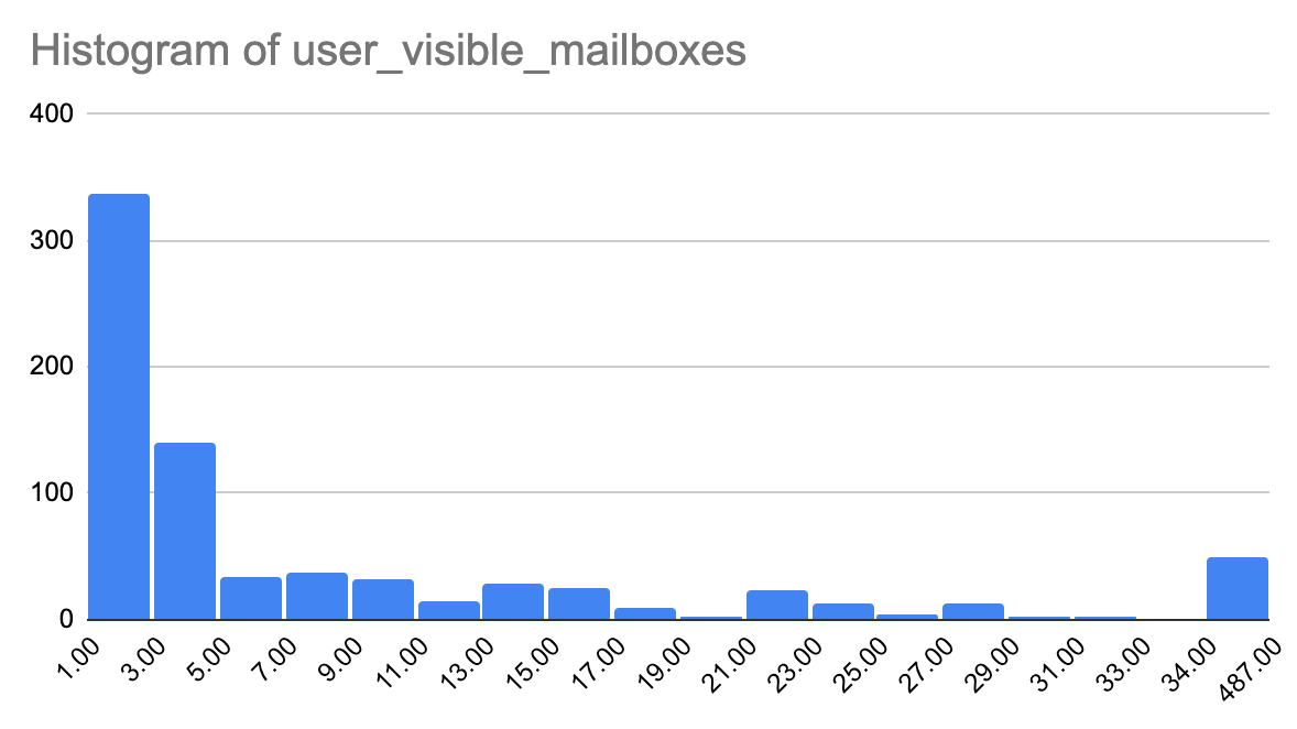
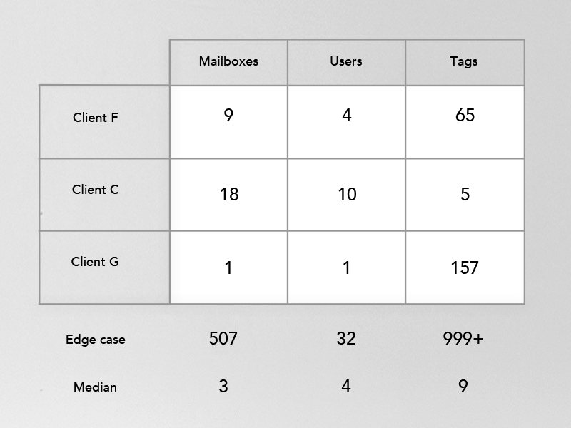
All of these insights were created from sales calls and customer interviews across a period of 6 months. We track requests, pain points, and cancellation reasons across various tools then analyze the needs and prioritize opportunities.


Metrics for success

1 - Less trial cancellations due to confusion about tags.
2 - Higher engagement with tags.
3 - Qualitative feedback of value added with select customers.
4 - More aha moments and conversions on sales calls.

Phase 2 - Competitive analysis


4 categories of reference

1. Direct competition (Front, Missive, Polymail, etc)
2. Tools users are migrating from (Gmail, Outlook, iMail, etc)
3. Hot new players (Superhuman, Hey)
4. Analogous experiences for the feature (Slack, Asana, Jira, etc)
...And let's not ignore the gorgeous clickbait of Dribbble 😎

Dribbble

Gmail redesign on dribbble

Front

Missive

Slack


Phase 3 - Big Ideas

We went wide with our exploration, reconsidering large aspects of the interface, in hopes of finding an elegant redesign to solve for the most user needs as possible. Sifting through hundreds of customer requests, we sketched ideas loosely, discussed feasilibilty with engineering daily, then got real about our constraints.


Here are a few higher fidelity images from those sketches.


1 - βœ… Filters

Filters up top, sitting as an information layer above the conversations.
Engineering constraint - massive restructuring of interface
Design pro - recognizable pattern
Design con - no opportunity to see all options at a glace, or counts


2 - πŸ“« Accordian

Collapsable accordian filters, showing selection on collapse.


Engineering constraint - massive restructuring of websockets to show counts in realtime
Design pro - leftsidebar is full of information at a glance. Easy to build more information incrementally.
Design con - Information dense, long scroll for some users


3 - πŸ’œ Favorites

Dealer's choice! Let the user decide what filters should be 1 click away.


Engineering constraint - massive restructuring, complex to handle counts
Design pro - Solves the most user needs in one elegant solution
Design con - adding more information to the sidebar

Some ideas were impossible; some were only possible with massive code restructuring, and some were easy. We connected the dots between impact and effort, and considered aquisition vs retention, ultimately prioritizing aquisition slightly.

Design with Real Data


Some facts

64% of accounts have under 5 mailboxes, users, and tags.
76% have under 10 mailboxes, 84% under 10 users, and 84% under 10 tags.
32% of accounts have no tags. 7% of accounts have over 100 tags. (side note - we need to create a way to delete tags!)
18% of tag names are 50-55 charachters long. 30% of tags are 20 charachters or under.
Users who say they 'love' tags mostly apply them,but only filter by them around certain times of the month.
27% of users only have 1 mailbox. One account has 487 mailboxes.

We chose 3 customers that represented 3 common information patterns and designed each idea with their information.

3 representative customers

For each customer we mocked up the 3 ideas with their data and got on a 30 minute call with them.


Client F

Few users and mailboxes, but many tags.
Image 1: accordian
Image 2: our suggested MVP of launching with only tags exposed
Not shown: Favorites


We learned that favorites were preferred by all clients, and was immediately understood conceptually. They each had very different, yet feasible, ways in which they would leverage favorites.

Prototypes


1 - Accordian Lists

This concept exposes 10 of each category and the 11th spot is a 'show more' affordance. Upon close the catergory selection is shown. Upon clicking 'show more' our existing dropdown list is exposed.


2 - Favorites

Video shows a color wireframe of how a user would first see their favorites, be invited to engage, create their own favorites, and then ultimately filter by favorites.

Tradeoffs


After much engineering exporation and a few hack days of refactoring, we determined that it was too time intensive to do the following: a) show the tag count next to the tag name, b) show more than 5 mailbox counts at a time, c) show more than 5 user counts at a time, d) allow each list to scroll within a scrolling sidebar, e) allow users to filter by multiple tags

UI Iterations


Mailbox list exploration

Here is a small sampling of iterations.


Tag list exploration

Here is a small sampling of iterations.


Selected state exploration

Final MVP

Tooltip

No tags

11-20 tags

Over 20 tags

After import

Mid import of tags

Searching

tooltip of a long tag

Redlines

The sidebar has endless possibilities to provide zero-click access to information.

Ultimately, our first iteration of the feature was part value add, and part refactoring for all the future iterations. We launched with just exposing the tags, without counts, and we will add complexity and affordances from there.