While at frog design, my team spent 9 months defining the future of our client's product line. We determined product-market fit for existing and non-customers, conducted an internal audit on the client's development and communication strategies, and co-created an MVP product to bring to market that would be the flagship of their software suite – embodying their new corporate vision of "powering connections."

In the end we had a video confering tool that was an empathy builder, productivity driver, and great for remote teams on all levels.

Role

Team of 8 – 2 strategists, 1 PM, 1 project lead, and 4 cross functional UI/UX/UR designers. I was one of the two UI/UX/UR'ers on the project from beginning to end.

Client

Global UCasS (unified communication as a service) provider, with over 4,500 employees worldwide, and offices in 80 countries. They historically provided on-prem telephony solutions as well as cloud based collaboration software.

Most Proud Of

Conducting longform onsite research in 4 countries, in 6 weeks, and bringing the client along!

Phase 1 - Research

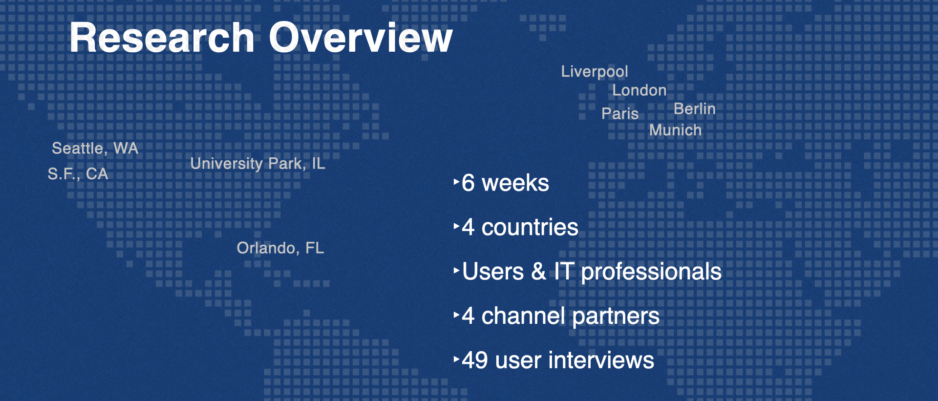
4 countries in 6 weeks

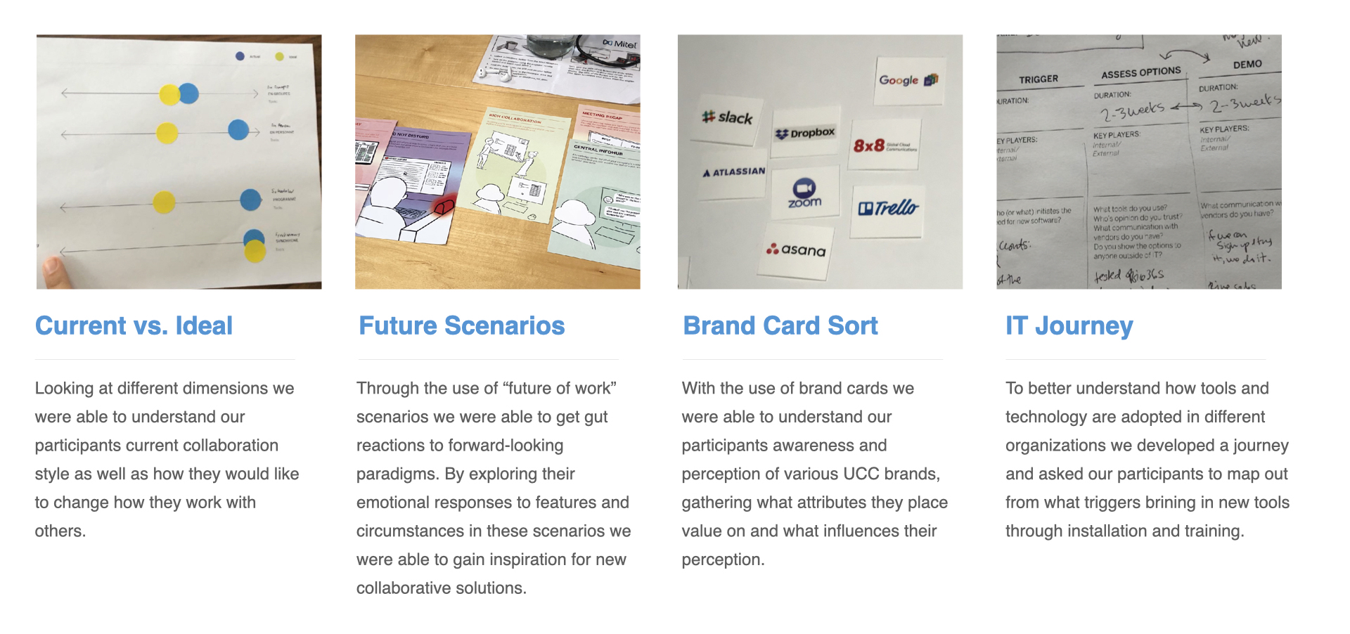
After rigorous planning and rehearsing, our team dispersed around the globe. From San Francisco, we conducted quantitative surveys, and in Europe and USA we conducted longform qualitative in-context interviews.
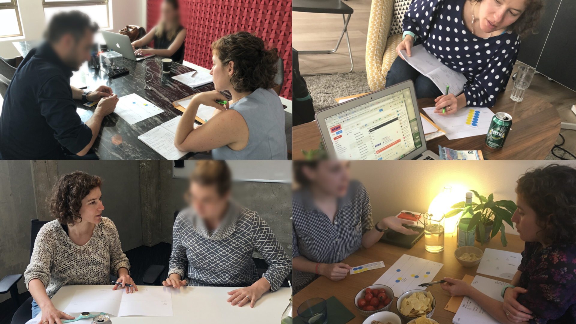

In-context

Interviews were 45 minutes each, all conducted on-site of the user's place of work.


In field activities

At the end of research, we had an understanding of cultural differences for internal digital communication that must be considered; an understanding of the fundamental differences of the client's existing customers vs the customers they wanted to acquire; and an understanding of the current pain points of internal and external digital communication. We also met a ton of interesting people that were eager for us to circle back and show them the prototype in 6 months.

Phase 2 - Synthesis & Ideation

Research Readouts

At the end of the research, we wanted to give the client a sense of the raw data, so they would be able to empathize with different opportunity areas and pain points. We did this through a series of meetings, workshops, and documents.


Archetypes

Because the client was casting a wide net, and wanting to design for current customers and new customers, along with including all geographical locations, and levels of heirarchy within an organization (boots to suits), we chose to use archetypes instead of personas. The ended up with 3 archetypes.


Journey Map - End Users

Showing the tool adoption journey in an organization for tools that are accessible to end users and can create a buzz organically within an organization (like Slack!).


Journey Map - IT

Showing the tool adoption journey for larger purchase software that must be vetted by IT (like G-Suite).


Competitive Analysis

The two strategists on the project put together an analysis of all the players in the space.


Insights & Opportunity

We had many validated Opportunity areas. Our biggest challenge was deciding on one!
After many workshops with much deliberation, we decided to move forward with the Opportunity of solving for productivity with remote teams. One insight leading up to this was 'The meeting is only 1/3rd of the meeting. The pre and post meeting are just as important for accountability, buy-in, and productivity.' Another insight was that 'remote work doesn't work if there are no rituals or team culture around making it work'.


By the end of this phase we had a validated opportunity area that we knew was going to be percieved as on-brand for the client, was meeting a critical pain point for new and existing users, was in the scope of technical feasibility for the client, and was addressing a very wide market demand.

Phase 3 - Design

Sketches and brainstorm sessions

In this phase we took a collaborative approach with the client - leading ideation sessions and brainstorms. We started with loose sketches and blue sky ideas, and honed in on a few key concepts that we refined into one product.


Sketches and brainstorm sessions

Each of these sketches represents an idea that attacks a critical pain point associated with the opportunity area.


Digital Sketches 1

Idea: Allow the user to invite individuals to only part of the meeting. Suggest alternative invitees. Suggest alternative times. Take out all work surrounding the meeting invite that can be automated, based on knowledge of employees calendars and org chart.


Digital Sketches 2

Idea: Express to individual contributors why they are being invited to the meeting and what they are expected to contribute.


Digital Sketches 3

Idea: Allow users to contribute to meetings that they cannot attend, via digital means that can be cataloged and shared during, before, or after the meeting.


Usability Testing

We conducted 8 interviews across 3 countries, all remote, during which we had users interact with a wireframe and attempt to accomplish tasks, then answer qualitative user value questions. We also shared final UI and asked questions about that. Here is a video of the wireframe, and 2 images of the final UI we proposed.


Final Design Desktop


Final Design Mobile


I'm excited to share that 1.5 years after our work ended, the client released the product! The value proposition is exactly what we steered them towards and we're all excited to keep an eye on their market share in the digital collaboration space.